
I kept buying the same pale blue dress every summer and then wondering why it looked washed out in photos. The moment I started thinking about where the color hits the eye and what it sat next to, the dresses I owned finally started to feel intentional. I still squinted at mirrors, messed up a belt loop or two, and learned that summer color styling is more about placement than new clothes.
These tips skew wearable and practical, not runway. Most items are budget friendly with a few splurges meant to last a season or two. If you live in a city, have limited closet space, and want outfits that photograph well, these ideas are for you. Expect easy swaps, a few tailoring notes, and guidance on fit so pieces actually flatter your frame.
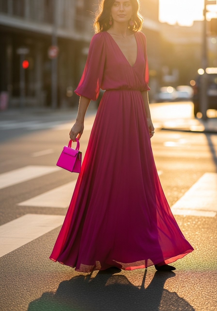
1. Put Color at Eye Level for Instant Freshness
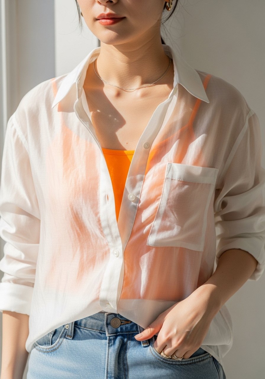
The quickest way to brighten a summer look is to place the brightest color near your face, either a top, a scarf, or bold earring. The 60/30/10 color rule works well here: 60 percent neutral base, 30 percent secondary tone, 10 percent bright accent, and the bright should sit at eye level to read in photos. Works for petite and tall frames alike because it draws attention upward. Try a lightweight linen-button-up-shirt for an inexpensive base.
Mistake to Avoid: Wearing a bold color only on the hem so it disappears in photos and does not brighten the face.
2. Use a Single Bold Piece With Quiet Neutrals
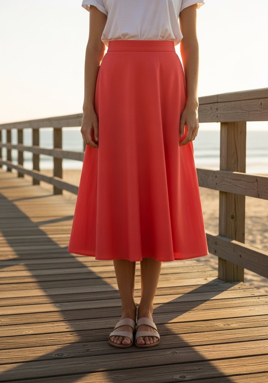
I rotated one bright skirt through five outfits last summer and it never felt repetitive. A bold midi paired with a white tee and a tan sandal is an instant ensemble for brunch or travel. This fits curvy and straight body types because you can adjust proportions with a tucked top or a cropped jacket. Try high-waist-midi-skirt-bright-coral for about $30-50.
Mistake to Avoid: Pairing two competing bright pieces of equal visual weight so they fight for attention.
3. Tone-on-Tone Layers for Soft Summer Palettes
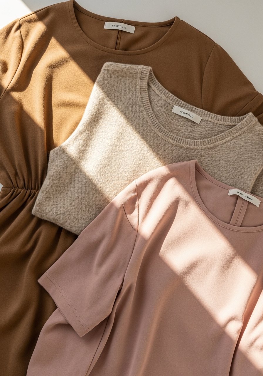
Layering similar hues—think sand, champagne, and blush—creates a quiet, polished summer look. The trick is varying texture: a linen shirt, silk camisole, and cotton trousers read as intentional. Works well for those who dislike stark contrasts. Budget tip: pick one silk-like piece and balance it with cheaper textured items. I wore this across seasons after rotating the combo for a full season and it held up in photos.
Mistake to Avoid: Using identical fabrics, which flattens the outfit and looks like a single block of color.
4. Color-Blocked Swim Cover With Neutral Basics
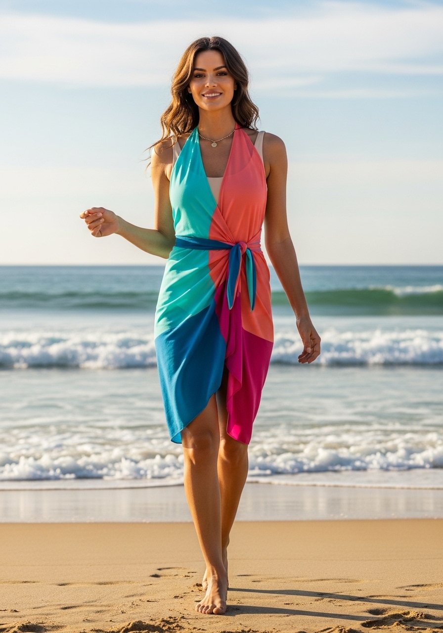
A color-blocked sarong or lightweight kimono gives a pool look dimension without extra packing. Pair it with a plain suit and simple slides for a balanced outfit. Small to medium bust sizes will find the block at the hip flattering, bigger busts can use the block lower to avoid drawing the eye upward. Try color-block-sarong-wrap for a travel-friendly option.
Mistake to Avoid: Wearing a print that matches your swimsuit too closely so the pieces merge into one indistinct shape.
5. Contrast Piping or Trim as a Small Investment
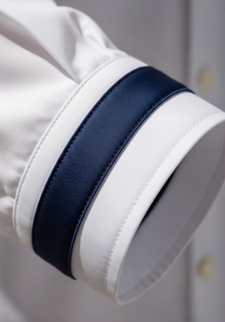
A small detail like contrast piping or trim makes a basic top feel tailored and summer-ready. It reads expensive in photos and costs little. This suits every body type because the line can elongate or frame depending on placement. For a budget buy, check piped-cotton-top which I used to upgrade plain jeans-and-tee days.
Mistake to Avoid: Choosing trim that matches your skin undertone exactly, which reduces the pop you are after.
6. Try a Colored Belt to Define Proportions
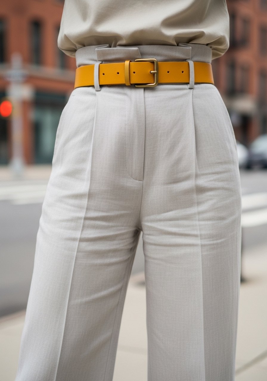
A narrow colored belt can change the perceived fit of a dress or trousers. Use a brighter belt on fuller hips to create a highlighted waist. On petite frames, pick belts under 1.5 inches wide so the proportion stays balanced. I swapped belts across the week and it was like a new wardrobe. Consider waist-belt-leather-mustard.
Mistake to Avoid: Using a too-wide belt that cuts the torso at the wrong spot for your height.
7. Refresh Tops With a Small Block Print
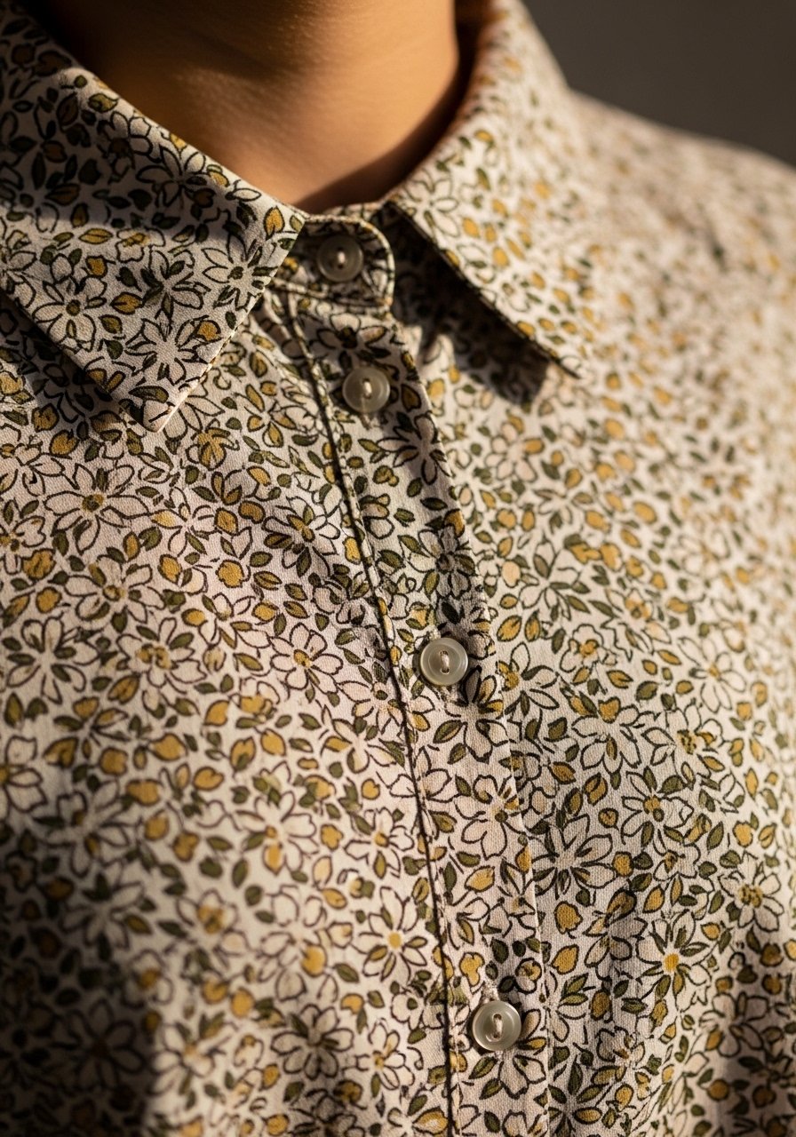
Small-scale prints read less busy than large motifs, so they work in summer where you want airiness. Pair a tiny print top with solid denim or culottes for balance. For curvy silhouettes, keep the print on a darker ground to streamline. Try small-floral-blouse under $40.
Mistake to Avoid: Mixing small prints with small accessories so the outfit looks cluttered in photos.
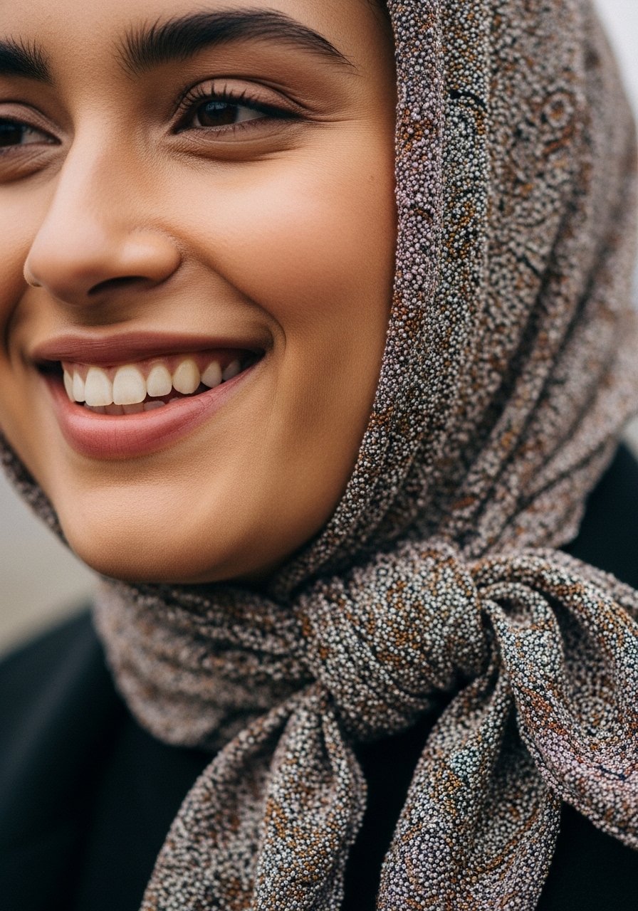
8. Use Scarves as Neck, Head, or Bag Accents
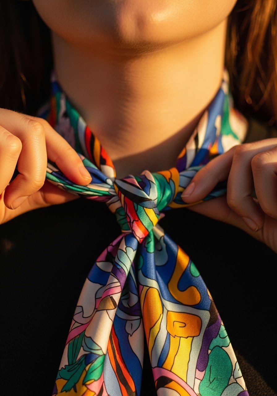
A silk or rayon scarf is the cheapest color trick that travels well. Tie it at the neck to draw attention upward, wrap it around a ponytail to add movement, or knot it on a bag handle for a styling lift. Works on all body types and is especially handy for quick outfit refreshes during hot travel days. I keep a few in my bag. Check silk-look-scarf-20×20.
Mistake to Avoid: Folding the scarf too thickly so it reads bulky at the neckline.
9. Bright Shoes As the One-Thing Statement
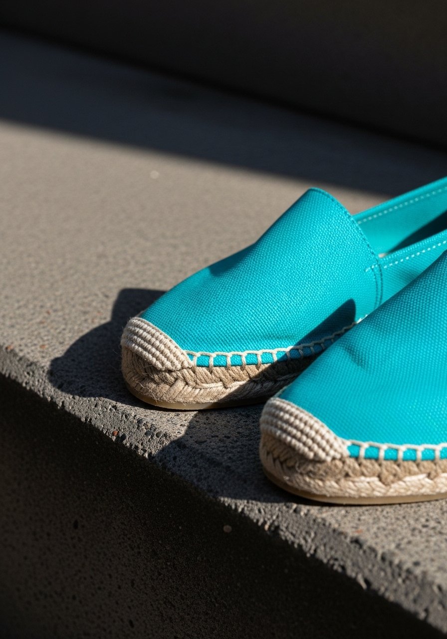
If you prefer neutrals, make the shoe the only bright element. A shoe at the hem gives a surprise pop in motion. This is great for apple-shaped bodies where attention at the hem balances a fuller midsection. I bought a pair of espadrilles for $45 and they made my plain outfits feel intentional. Try turquoise-espadrille-wedges.
Mistake to Avoid: Matching shoe color exactly to a bag, creating a disjointed two-tone that reads dated.
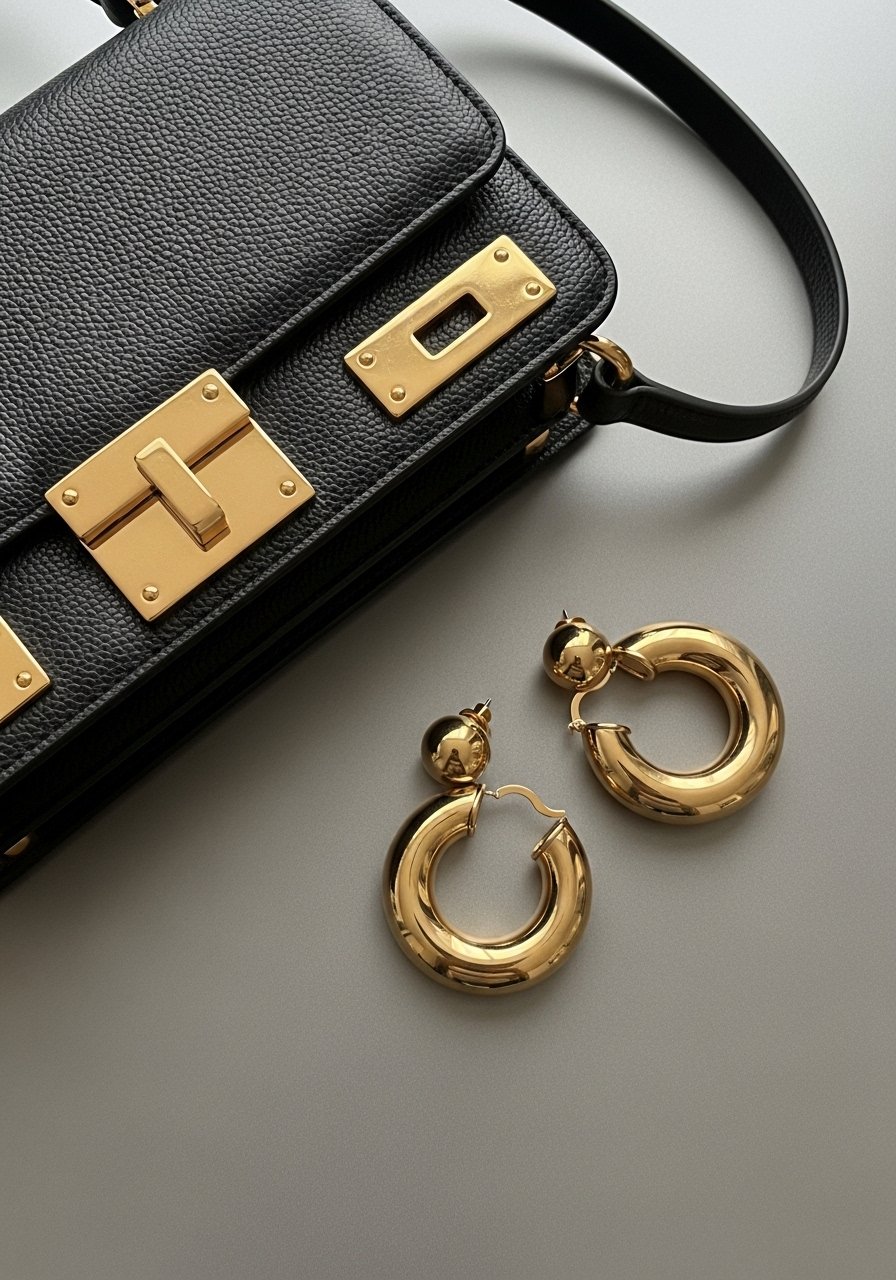
10. Try Tonal Jewelry Clusters
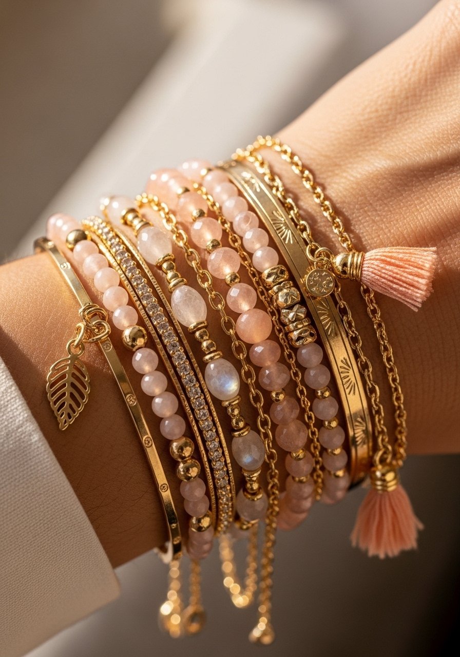
Cluster small jewelry in only one tonal family so it reads cohesive and light. A thin gold chain, a pearl bracelet, and a peach resin bangle together look curated. This works for all necklines and layers nicely over sleeveless summer dresses. For a simple purchase, gold-chain-bracelet is a reliable base.
Mistake to Avoid: Mixing metals with bright colors that compete, making the look feel noisy.
11. White Jeans With a Single Color Top

White bottoms are summer staples and pair best with one saturated top. Cobalt or coral are good middle-ground colors that flatter most skin tones. For tall frames, a full-length straight jean works well. Petite frames may prefer a cropped white ankle jean to keep proportions tidy. I prefer a slightly rigid denim to avoid cling. Try white-straight-jean-ankle.
Mistake to Avoid: Wearing see-through white denim without the correct underlayer so the outfit loses polish.
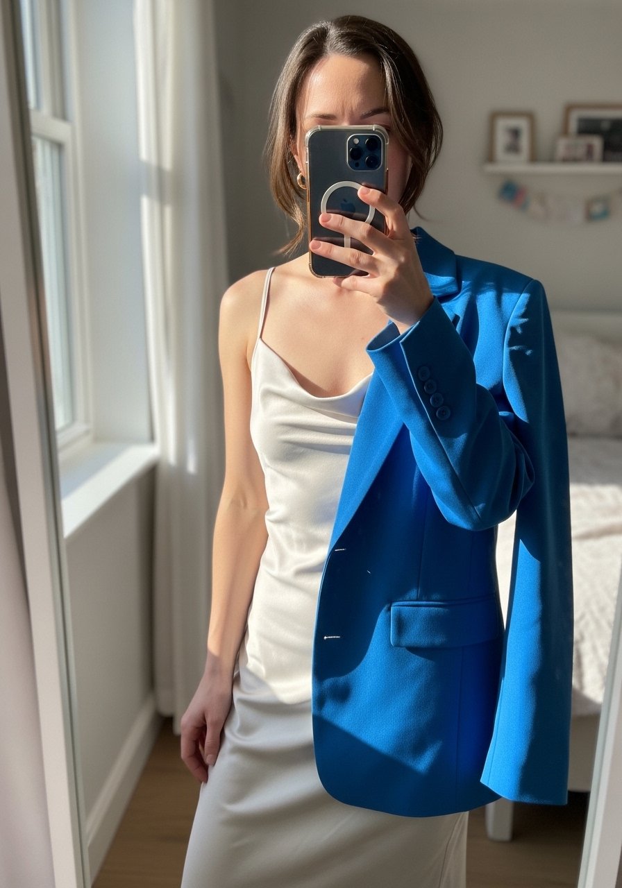
12. Use a Neutral Outer Layer to Tame Brights
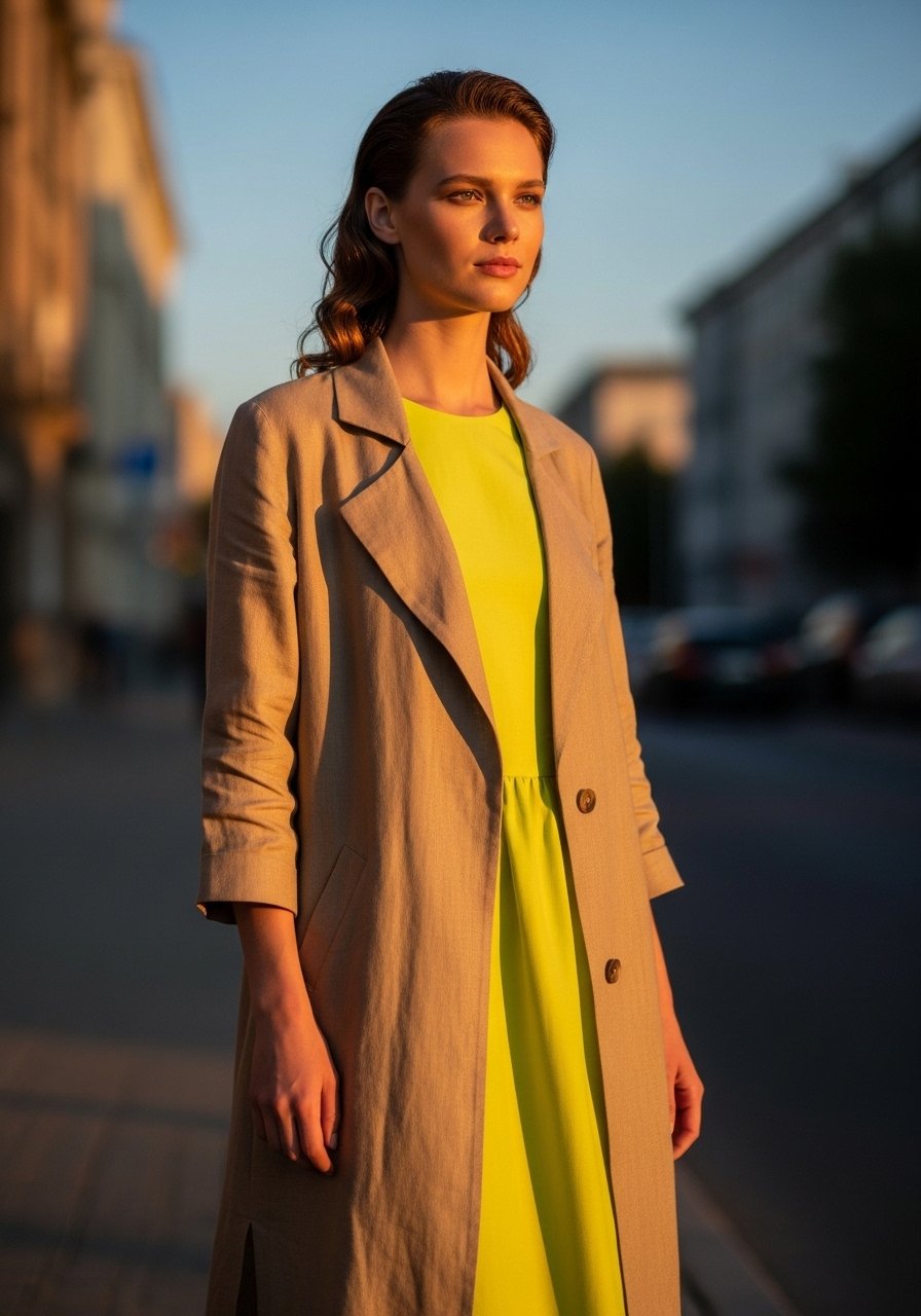
If your bright piece feels too loud, add a neutral duster to mute the effect while keeping color visible at the edges. Works especially well for those who want color but also professional polish. For office-appropriate looks, choose a mid-calf length so the duster reads intentional. I reach for a lightweight tan-linen-duster when I need to calm prints.
Mistake to Avoid: Choosing a duster in a dull fabric that makes the outfit heavy instead of airy.
13. Match Lip Color to a Small Garment Accent

Matching lipstick to a small garment detail creates cohesion without being matchy-matchy. A lip tint that reads slightly warmer than the fabric helps the face stand out in summer light. This works across skin tones when you pick a shade one step deeper than the garment. I often pair a coral lip with a dress that has coral piping. Try tinted-lip-stain-coral.
Mistake to Avoid: Trying to match shades exactly so the effect looks forced and plastic.
14. Play With Sheer Layers Over Solids
A sheer overlay adds a summer texture and lets color peek through in an interesting way. Wear a sheer striped blouse over a solid slip to get both pattern and color. Works on most shapes because the underlayer defines the fit. Lightweight chiffon or mesh keeps the look cool. I bought a sheer top for $28 and it became a travel staple. Try sheer-striped-top.
Mistake to Avoid: Choosing a sheer layer with too many colors that compete with the base.
15. Uniform Approach: Same Color, Different Garments
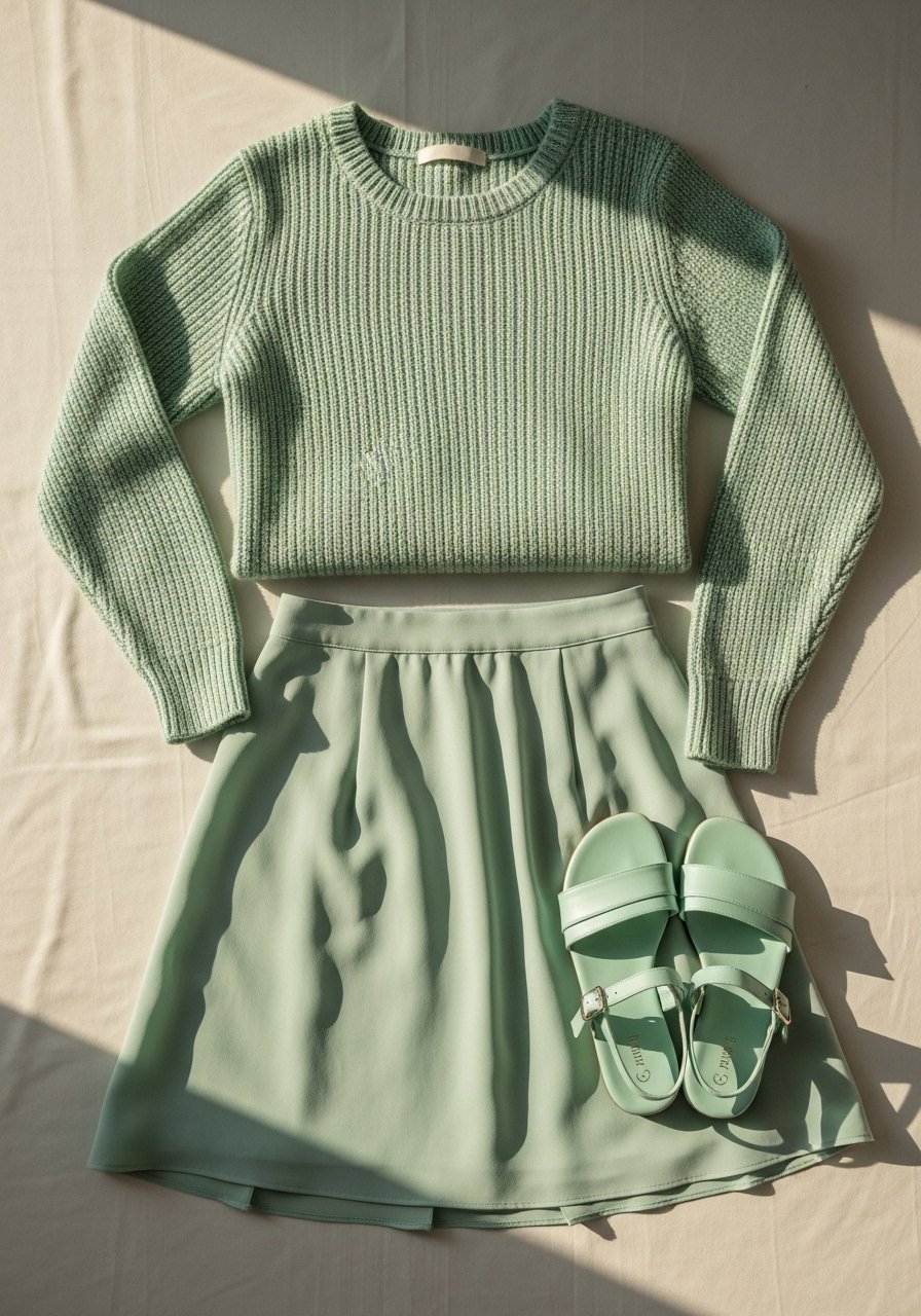
Wearing the same color in different pieces creates cohesion and looks intentional. Mix shades—mint tee, deeper mint skirt, pale mint accessory—to add depth. This works for tall frames especially well when you play with lengths to avoid a single block. I tested this for a weekend and it read polished in photos. Pick a mid-priced mint-skirt-midi.
Mistake to Avoid: Using identical shades and textures so the outfit becomes visually flat.
16. Use a Neutral Base to Test New Colors
If you are unsure about a trend color, pair it with a neutral base first. A slip dress or tee in beige or navy lets the color show without committing to a full look. This is a good way to try seasonal shades if you have a small closet. I tried a lime blazer over navy basics before buying more lime pieces. Consider navy-slip-dress.
Mistake to Avoid: Buying a head-to-toe color outfit without testing the shade near your face.
17. Contrast Textures to Soften Bright Colors
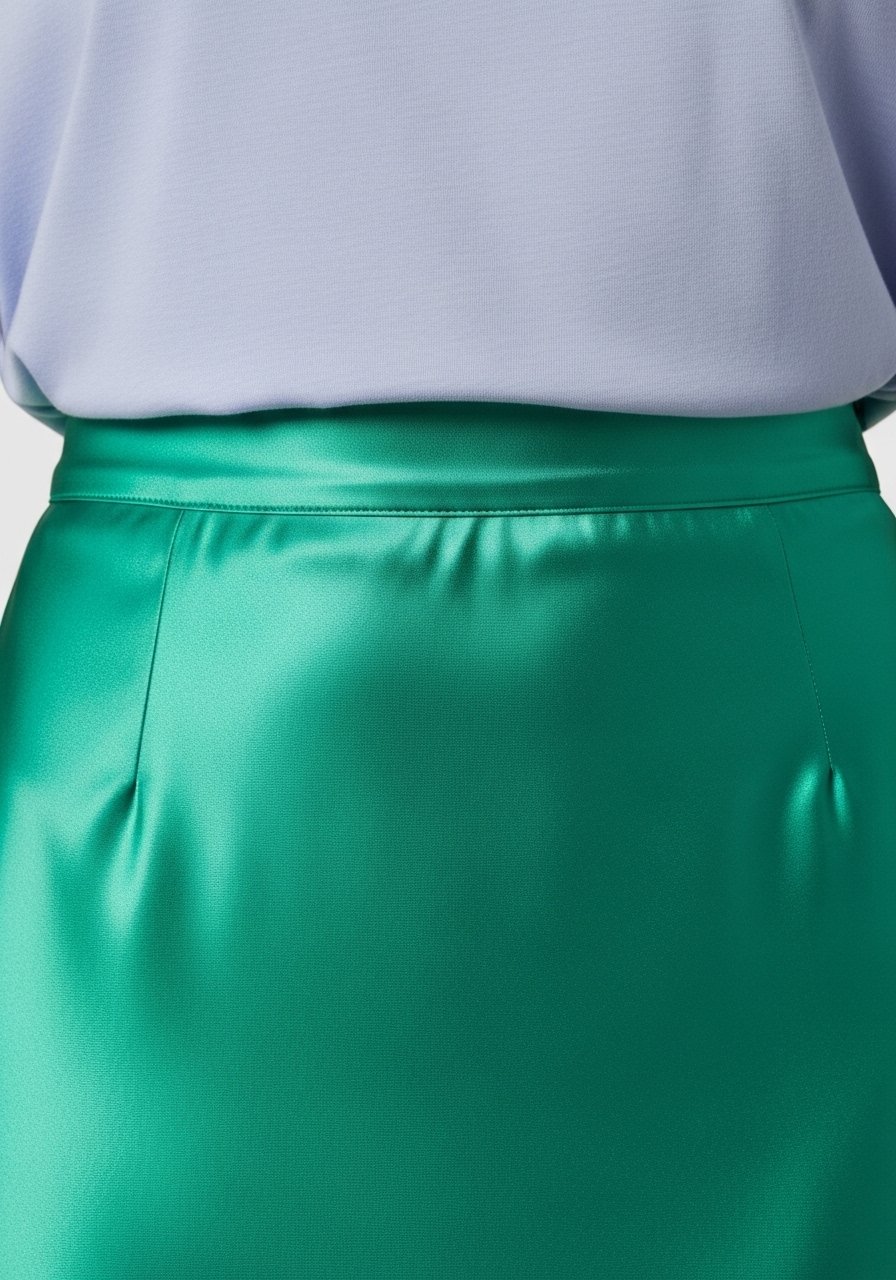
Satin or silk in a bright color can feel loud. Temper it with matte textures like cotton or linen to make the color wearable. This approach fits petite and curvy bodies because texture creates visual balance. I often layer a slubby tee with a satin skirt to tone down sheen. Try satin-midi-skirt-bright.
Mistake to Avoid: Pairing two shiny fabrics that reflect light and compete in photos.
18. Capsule Pop: One Printed Piece and Four Solids
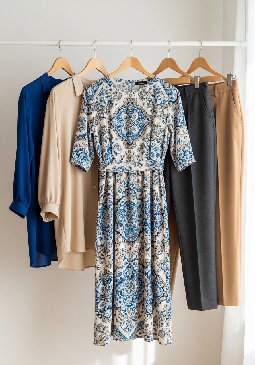
Build a mini capsule where one printed item guides the color story for four solid pieces. It makes packing for summer trips simple and keeps outfits cohesive. Works for any body type because you can choose fit for each garment separately. I use this trick when I travel light. Pick a printed dress like summer-print-dress.
Mistake to Avoid: Choosing a print with too many unrelated colors, which makes matching solids confusing.
19. Play With Scale: Mini Accent, Maxi Neutral
A tiny, bright accessory set against a maxi neutral reads modern and relaxed. A mini bag or narrow scarf works as the accent. This is forgiving on all body types because the eye rests on the larger neutral. I used a neon micro-bag to modernize neutral linen dresses. Try mini-crossbody-neon.
Mistake to Avoid: Using a small accent that is too small to be seen in photos, losing its purpose.
20. Subtle Ombre With Knitwear
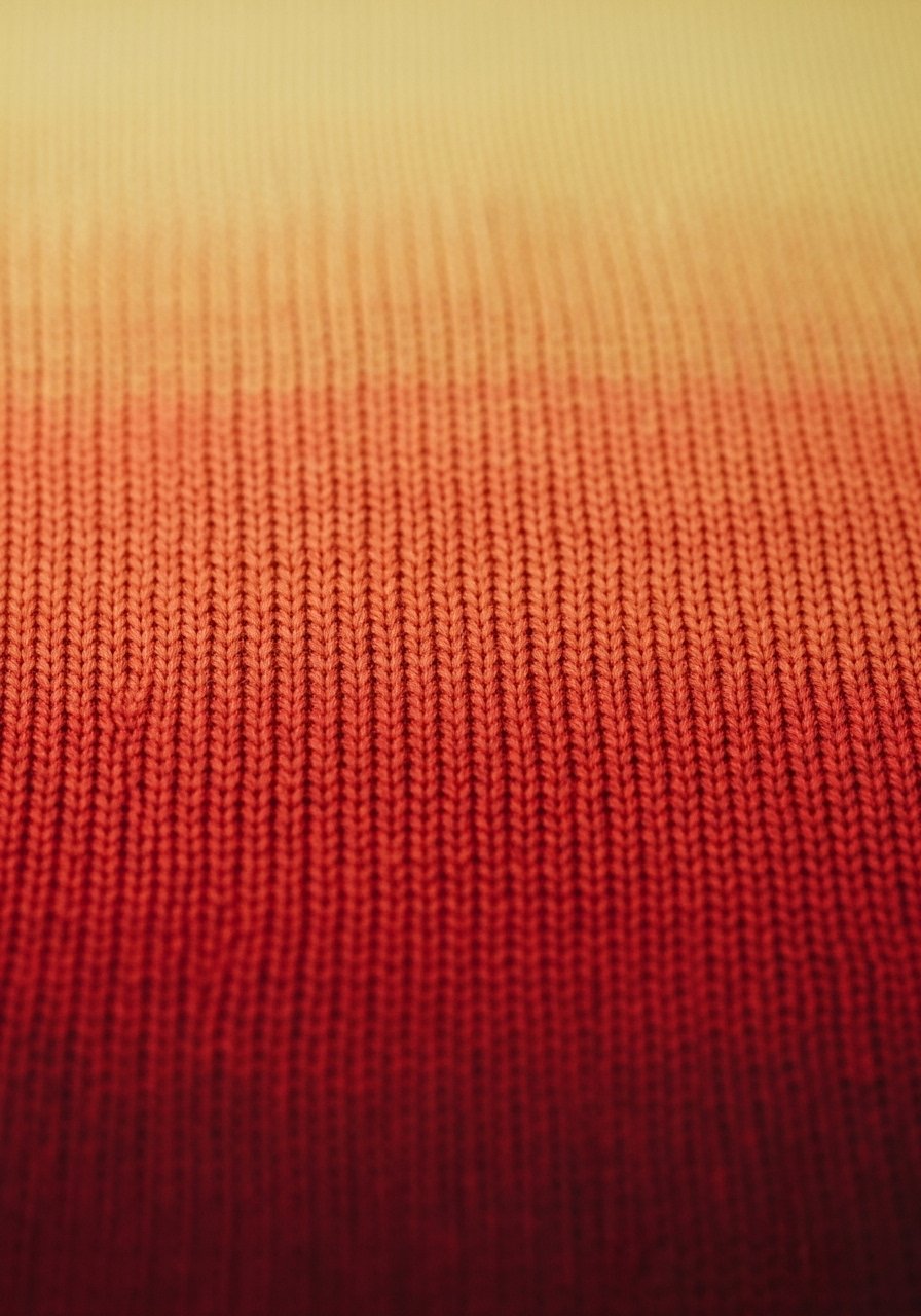
A lightweight ombre knit offers color interest without hard contrasts. Wear it with simple trousers for a summer evening. It suits broad shoulders when the gradient runs top to bottom to soften lines. I picked a thin knit that layered easily over tanks. Try ombre-lightweight-sweater.
Mistake to Avoid: Choosing a heavy knit in summer that adds bulk and traps heat.
21. Neon Trim in Sporty Pieces
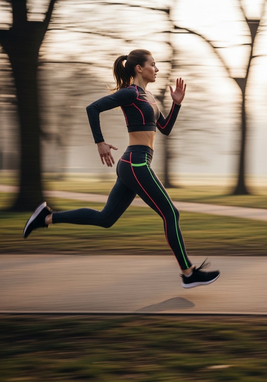
Neon piping on sporty pieces adds energy while keeping the main garment neutral. Great for workout wear and poolside sets. For shorter torsos pick a higher waist legging to avoid cutting proportions oddly. I have a neon-trim tee that makes old leggings feel fresh. Check neon-piped-tee.
Mistake to Avoid: Wearing neon across the whole outfit so it reads like a costume instead of sporty accents.
22. Monochrome Suiting in Summer Fabrics
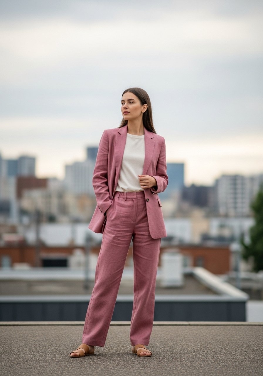
A monochrome suit in linen or seersucker in a summer color feels modern and appropriate for work events. Choose a cropped trouser for petite frames or full-length straight trousers for taller frames. I wore a dusty rose set to a rehearsal dinner and it looked intentional without being formal. Try linen-suit-dusty-rose.
Mistake to Avoid: Picking an ill-fitting blazer so the suit reads sloppy rather than refined.
23. Layer a Bright Camisole Under Sheer Shirts
A bright camisole under a white or sheer shirt is an easy way to introduce color and control coverage. Works for all bust sizes because the top layer gives structure. I often use this for dinner out when I prefer a hint of color without a full commitment. Try bright-camisole-silk-look.
Mistake to Avoid: Choosing a camisole in a clashing undertone that fights with your face rather than enhancing it.
24. Match Nail Color to a Shoe or Bag
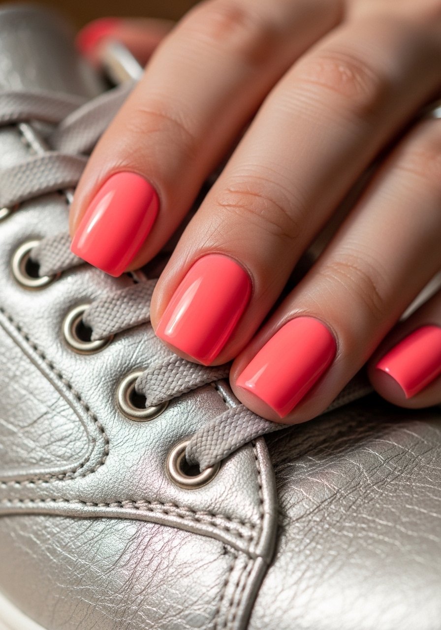
Coordinating nail color to one accessory ties the look together subtly. It is a small detail that shows intentional styling. Works well on short or long nails and makes your accessories feel upgraded. I keep a small rotation of polishes for this. Try coral-nail-polish-quick-dry.
Mistake to Avoid: Using a nail polish that clashes with skin undertone and makes the hand look washed out.
25. Add a Printed Belt for Mid-Season Interest
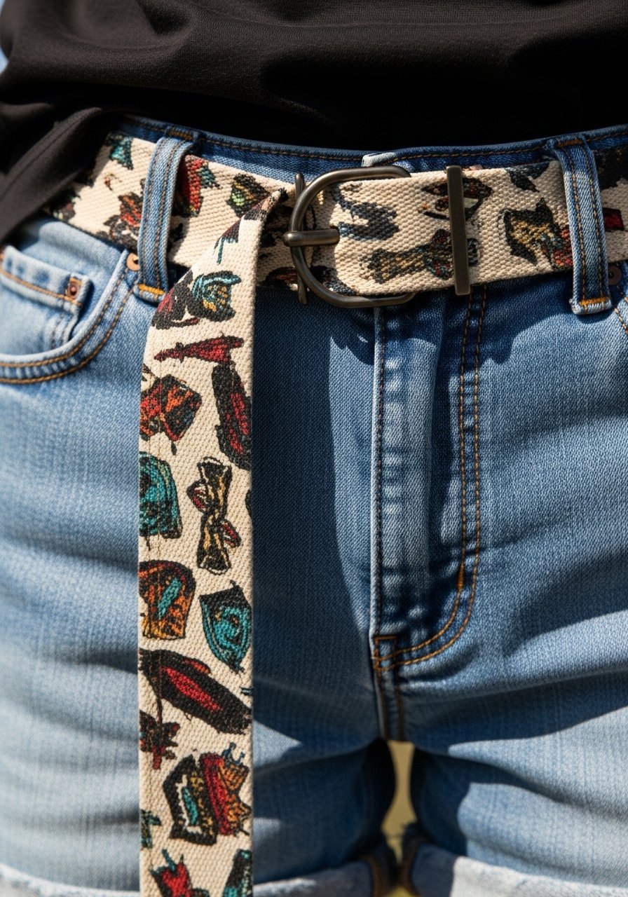
A printed belt adds color and pattern to otherwise plain summer outfits. Canvas belts with floral or geometric prints are budget friendly and packable. This suits straight and athletic shapes where a belt can define the waist. I swapped a printed belt into many looks last month and it felt new each time. Try printed-canvas-belt.
Mistake to Avoid: Using a belt with too busy a print that fights with patterned garments.
26. Wear Sunglasses With Colored Frames
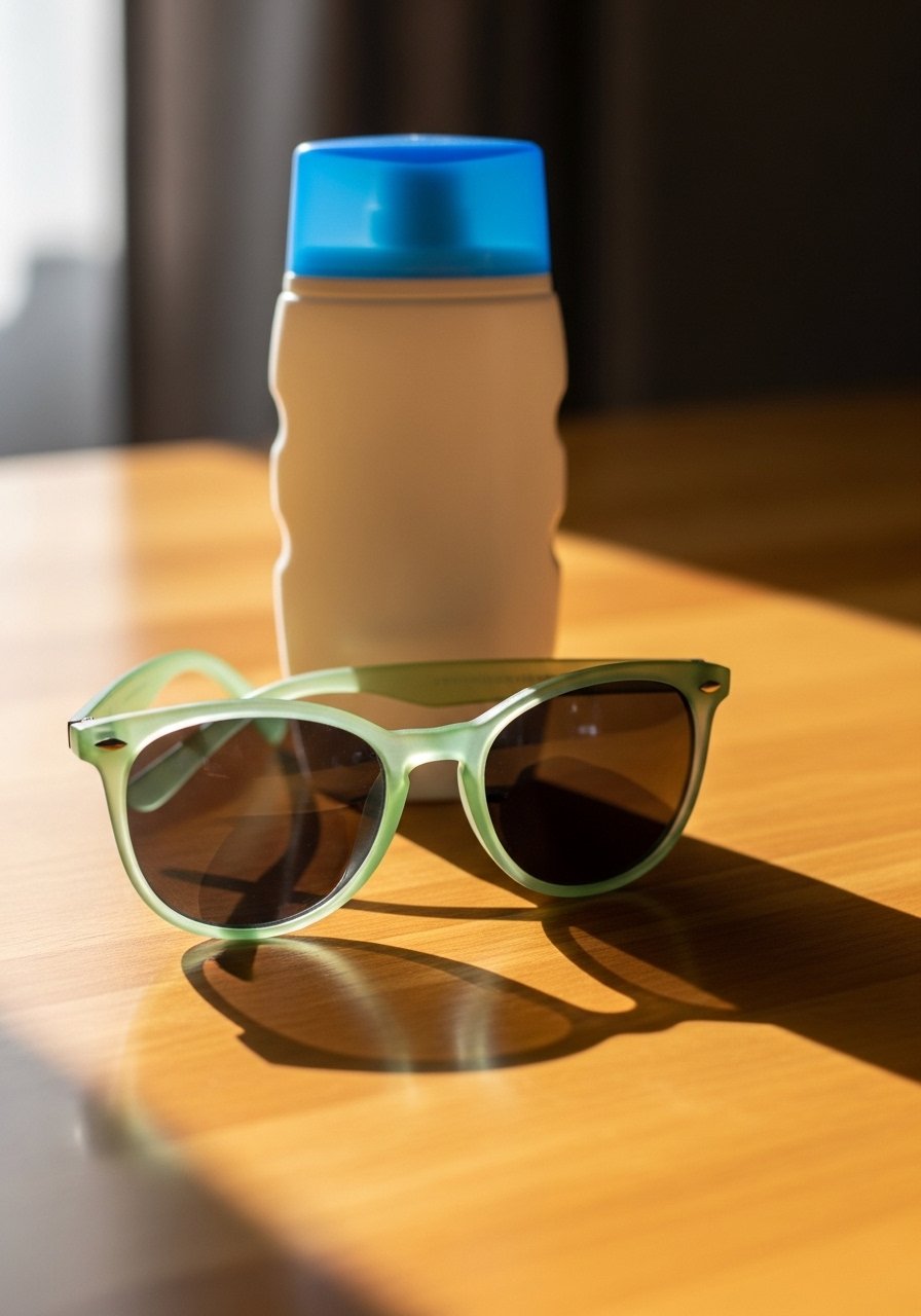
Colored-frame sunglasses add a playful note to summer outfits and keep the face shaded. Pick a hue that complements your hair or one accessory. For round faces choose slightly angular frames to balance curves. I bought a pair in pale green and they instantly modernized neutral outfits. Try pale-green-sunglasses.
Mistake to Avoid: Choosing a frame that matches skin tone too closely so it disappears on the face.
27. Switch Bag Hardware to Match Metal Jewelry
Matching your bag hardware to your jewelry keeps the look coherent. If you wear mostly silver, choose a bag with silver fittings and vice versa. It is a small detail that photographs well and makes outfits feel thought out. For a casual summer bag try canvas-tote-gold-hardware.
Mistake to Avoid: Mixing multiple metal finishes in small accessories so the outfit looks haphazard.
28. Use a Lightweight Patterned Kimono As a Dressing Shortcut
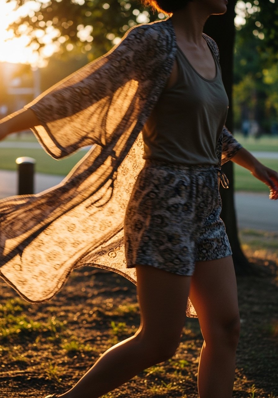
A patterned kimono thrown over a tank and shorts reads like a complete outfit in seconds. Pick a kimono with two dominant colors that you can extract for accessories, making coordination simple. This is ideal for travel and small-closet living because it layers without bulk. I wore mine across a long weekend and it replaced three outfits. Try lightweight-patterned-kimono.
Mistake to Avoid: Choosing a kimono with too many clashing colors so it becomes hard to match with basics.
Your Capsule Picks
- Honestly the best $28 I spent on a summer print, summer-print-dress (~$28-60). A single printed dress guides a capsule.
- For layering, linen-button-up-shirt (~$25-45). Natural fabric, breathable for hot days.
- A neutral base: navy-slip-dress (~$20-40) that doubles as an underlayer.
- Accent shoes: turquoise-espadrille-wedges (~$40-70). Adds color at the hem.
- Lightweight outer: tan-linen-duster (~$50-90). Tames bright pieces.
- Scarves: silk-look-scarf-20×20 (~$12-25) for neck or bag accents.
- Mini bag: mini-crossbody-neon (~$25-50) for a bright pop.
- Belts: waist-belt-leather-mustard (~$20-40) to define shape.
- Sunglasses: pale-green-sunglasses (~$15-35).
- Satin skirt: satin-midi-skirt-bright (~$30-60) for texture contrast.
- Sheer layer: sheer-striped-top (~$20-40).
- Accessory base: gold-chain-bracelet (~$10-30).
Styling Tips I Keep Coming Back To
Thin coats beat one thick coat every time. Three lightweight layers like a tank, a shirt, and a duster look more considered than one heavy top. Add tan-linen-duster for evenings.
Swap a full match for a tonal complement. Instead of matching blue-to-blue, pick a warm coral accessory to lift the outfit. I use mini-crossbody-neon for this.
Curate by function. Pack one printed piece and four solids for most trips and you will have 10 outfits. My favorite print is the summer-print-dress.
Keep a small stock of neutrals in different textures. A cotton tee, a silk camisole, and a linen shirt cover hot days. For camisoles I like bright-camisole-silk-look.
Notice proportion shifts by trying a garment with the shoes you plan to wear. A midi can read long with flats and balanced with wedges. I compare looks with turquoise-espadrille-wedges.
Use one small deliberate accent instead of many tiny ones. A printed belt or single bright shoe reads modern. For belts try printed-canvas-belt.
Rotate one standout piece through the week. If you pick a skirt or jacket in a good color, you will wear it more. My go-to is high-waist-midi-skirt-bright-coral.
Match small hardware to jewelry for polish. A bag with gold fittings looks cohesive with warm jewelry. See canvas-tote-gold-hardware.
Most people spend somewhere between $500 and $800 when they finally commit to refreshing a room.