
I kept asking for thinner lines and then watching them blur into a soft gray smudge after a few months. The turning point came when my artist showed me a stencil with slightly wider letter spacing and I finally understood how tiny tweaks change the way fine line text heals. After that I stopped chasing razor-thin strokes that would not last and started choosing placement, spacing, and aftercare that actually preserve detail.
These are practical fine line ideas for people who want small text that stays readable and is easy to hide if needed. Most picks are low budget and fit a single-session appointment. I write from across five shops I have visited, and I include simple aftercare tools and one small technique tweak you can ask your artist to try. Expect honest trade offs, like some placements needing touch ups sooner and some designs that age beautifully with minimal fuss.
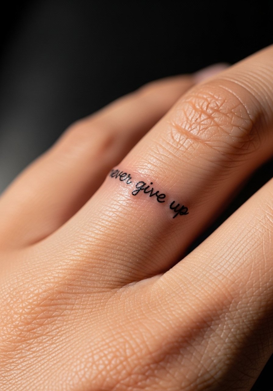
1. Inner Wrist Single-Needle Script

Start with the inner wrist if you want a tiny work-friendly reminder that still reads close up. Single-needle script looks delicate because it uses one fine line rather than a grouping of larger needles. What makes it work is shallow needle depth, usually around 1 to 1.5 millimeters, so the line sits in the dermis instead of being pushed too deep. That shallow depth means less blowout but also requires precise aftercare. This fits anyone who likes delicate pieces and has time for careful healing. For supply, I keep a small jar of fragrance-free tattoo balm on hand to prevent scabbing.
Style/Technique: Single-needle script
Pain Level: 3/10
Session Time: 0.5 to 1 hour
Best For: Inner wrist, visible but coverable, first-timers
Mistake to Avoid: Asking for thinner than necessary lines, which increases the risk of loss of definition during healing.
2. Collarbone Cursive With Subtle Spacing

A collarbone script reads elegant and photographs well because the flat surface keeps letters clear. The trick is slight kerning, adding about 1 to 1.5 millimeters between letters so the ink does not bleed into a single shape. That spacing is a small detail many artists skip when replicating tiny fonts from photos. This option gives an airy, wearable look for anyone comfortable with a visible neckline piece. Budget wise it is usually a short session and easy to touch up. For at-home prep, use a transfer gel so your artist can preview spacing on skin.
Style/Technique: Cursive script with increased kerning
Pain Level: 4/10
Session Time: 0.5 to 1 hour
Best For: Collarbone, wearable visibility, fashion-forward looks
Mistake to Avoid: Choosing a font image with no spacing notes, then expecting it to translate the same on curved skin.
3. Tiny Sternum Script For Discreet Placement

For people who want a private piece that can peek out with low necklines, the upper sternum is a great spot. The skin here holds delicate lines well because it is less mobile than fingers or sides. What makes it visually successful is a short baseline and slightly taller x-height so letters do not compress during healing. It feels intimate when you wear it and stays mostly hidden at work. Expect a moderate sting and about 45 minutes in session time. A small tube of sensitive skin sunscreen is something to buy before sunlight exposure after healing.
Style/Technique: Centered script, short baseline
Pain Level: 5/10
Session Time: 0.5 to 1 hour
Best For: Sternum, coverable, low neckline reveal
Mistake to Avoid: Skipping sun protection after healing, which fades fine gray lines fastest.
4. Micro Dot Accents To Lock In Letters

If you are worried tiny strokes will turn into a blur, ask for micro dot accents to anchor key points in the letters. Strategically placed 0.5 to 1 millimeter dots add reading cues without changing the delicate look. This technique is a gap many articles miss, yet it helps maintain legibility as ink settles. It is subtle and pairs well with single-needle work. Budget and session time stay low. I usually suggest a black-grey ink for the dots to avoid stark contrast that reads heavy later. Keep a black-grey tattoo ink on your list for reference photos to share with your artist.
Style/Technique: Dot-anchored script
Pain Level: 3/10
Session Time: 0.5 hours
Best For: Anyone wanting tiny text that reads longer
Mistake to Avoid: Adding dots too close to letters, which can create a merged shape as the ink spreads.
5. Wraparound Floral With Letter Integration

Pairing a small floral line with script hides minor aging while giving the piece personality. The floral should be in the same needle family as the text, usually 1RL to 3RL, so line weights match. What makes this work is arranging stems to sit between letters rather than on top, keeping the text readable. This idea solves the frustration of tiny text feeling fragile and also gives you a slightly larger visual that ages more gracefully. It is beginner friendly in budget and looks intentional. Consider bringing a photo of a fine line floral reference for the artist.
Style/Technique: Integrated floral and script
Pain Level: 4/10
Session Time: 0.75 to 1.5 hours
Best For: Upper arm, decorative yet readable
Mistake to Avoid: Placing flowers over key letter junctions, which obscures the word as it heals.
6. Vertical Ribcage Script For Longer Phrases

When you want a bit more length without stretching across the body, vertical ribcage script creates a discreet column of text. The skin on the ribcage holds line work well if the artist uses consistent 1.2 to 1.8 millimeter depth. Because the area moves, advise your artist to avoid hairline thin loops that can fill in. This placement solves the visibility versus coverability tug that frustrates a lot of people. It tends to be higher pain but still a single session. Pack a soothing aloe gel for immediate aftercare.
Style/Technique: Vertical rib script
Pain Level: 6/10
Session Time: 1 to 1.5 hours
Best For: Ribcage, coverable, longer phrases
Mistake to Avoid: Choosing ultra-cursive fonts with tight loops that close up during healing.
7. Finger-Adjacent Script For Longevity
Finger tattoos fade fast and often need touch ups. A simple swap is placing the word just off the pad, on the side near the base. That micro-shift reduces friction and oil contact, so letters last longer. If you love the finger look but want longevity this is the compromise most artists recommend. It is quick, low-cost, and more durable than knuckle or pad placement. For healing, keep it wrapped when needed and use a lightweight tattoo balm sparingly.
Style/Technique: Side-of-finger script
Pain Level: 4/10
Session Time: 0.25 to 0.5 hours
Best For: Fingers, people who want the look with fewer touch ups
Mistake to Avoid: Putting text on the pad of the finger, which almost always blurs within months.
If any of these ideas have you ready to shop for the right tools and balms, here are the essentials I actually reach for.
Fine Line Kit For Small Scripts
Aftercare & Prep:
- Fragrance-free tattoo balm (~$8-18). Great during active healing for thin lines.
- Tattoo transfer gel (~$6-12). Helps preview spacing and placement.
- Lightweight tattoo sunscreen (~$10-20). Use after healing to prevent fade.
Tools & References:
- Single-needle tattoo machine (~$50-150). Useful if you are researching technique references.
- Black-grey tattoo ink (~$10-30). Share this color family with your artist when you want soft lines.
- Aloe gel for tattoo aftercare (~$6-15). For cooling first aid.
- Fine line reference book (~$15-30). Bring a printed reference so artist and you are on the same page.
8. Petite Script Behind The Ear For Discreet Reminders
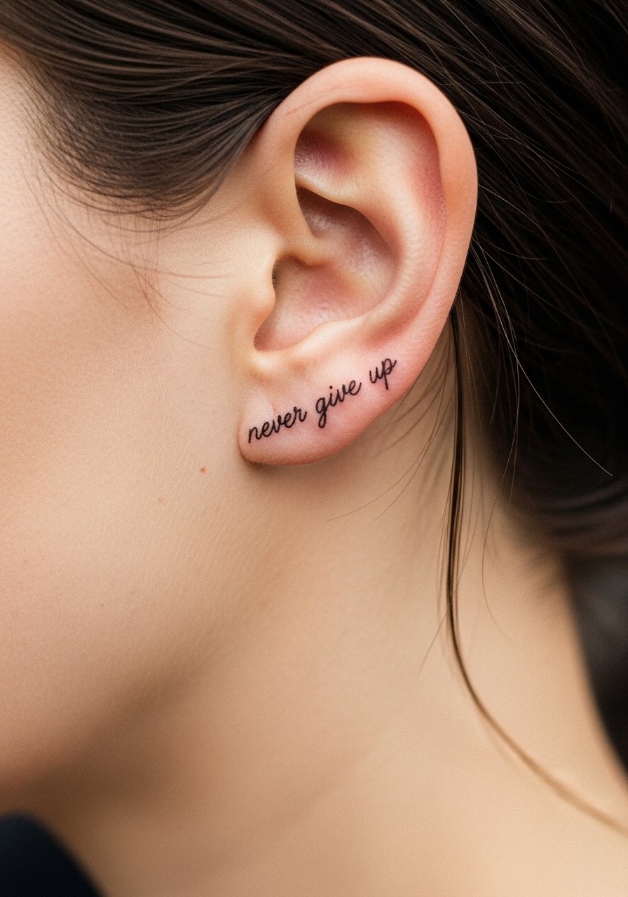
Behind the ear is almost invisible in profiles and it ages gracefully because it is a low-friction zone. The area requires a tiny stencil with letters slightly taller than your reference photo, so each stroke has room to settle. This placement solves the privacy problem for people who want text but need something easily hidden. Sessions are short and aftercare is straightforward because clothing rarely rubs the spot. Pack a small compact balm tin for discreet upkeep.
Style/Technique: Tiny behind-ear script
Pain Level: 2/10
Session Time: 0.25 to 0.5 hours
Best For: Behind ear, ultra-discreet, frequent travelers
Mistake to Avoid: Using ultra-fine fonts without scaling up the letter height for skin movement.
9. Slightly Bolder Script For Longer-term Clarity

If longevity is your priority, ask your artist to make the line just a touch bolder with 2RL or a slightly darker gray wash. The result still reads delicate from a distance but keeps edge definition as the ink naturally spreads by about 0.5 millimeters over years. This is one of the solid swaps I recommend instead of chasing impossible thinness. It suits people who want readable text without frequent touch ups. For at-home care, use a lightweight SPF stick after healing to extend crispness.
Style/Technique: Slightly bolder single-needle script
Pain Level: 3/10
Session Time: 0.5 to 1 hour
Best For: Inner forearm, people who want less maintenance
Mistake to Avoid: Insisting on the absolute thinnest line, which often leads to early loss of detail.
Keeping Tiny Script Crisp
Thin lines heal thinner than they look. Ask your artist to scale letters up by about 10 to 15 percent from your reference photo so they settle into the skin and remain legible, and pick a tattoo transfer gel to preview spacing.
Grab fragrance-free tattoo balm. Apply a pea-sized amount twice a day for the first week and you reduce scabbing that eats fine detail.
I used to think touching up immediately was the answer. Wait until full settling, usually three to four months, before scheduling any touch up. A black-grey ink sample note helps the artist match original depth.
Most people worry fingers or hands will last. Move text off high-friction pads when you can, or choose a slightly bolder needle setting that still reads delicate. A compact balm tin is the easiest everyday keeper.