
I kept trying to cram every swirl, dot, and mandala into one sleeve, then wondering why it read as noise from across a room. The moment I asked one artist to simplify motifs into bands and negative space the whole arm finally breathed. That single edit made my sleeve read like jewelry, not a scrapbook, and it is the change I still recommend after across five shops I have visited.
These ideas are for people who want an ornamental sleeve that reads as a single piece, not a collage. Expect a mix of affordable approaches and intermediate techniques, with most looks doable in two to four sessions depending on coverage. Budget notes appear with each idea and I call out where a design is work-visible or easy to cover. Across five shops I have visited I learned the same rule, less is more spacing-wise, especially when you want the design to age well.
1. Filigree Band Stacking
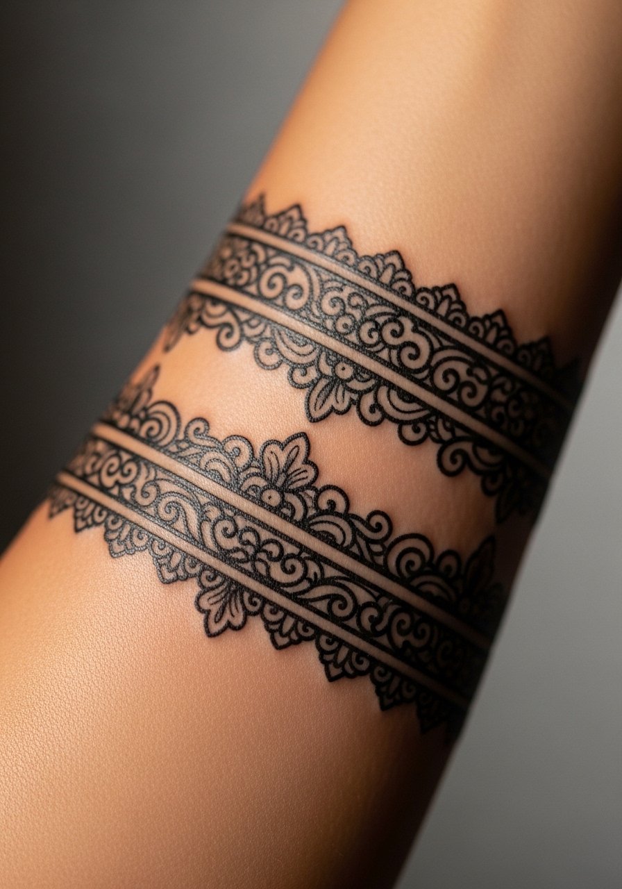
Think of this as wearing layered bracelets in ink. Narrow filigree bands, drawn with a 0.35 mm single needle for the finest lace, alternate with slightly bolder 0.6 mm bands to create rhythm. The result reads like jewelry and is easy to stagger so the sleeve moves with muscle shape. This suits someone who wants a coverable look for work, and it is a lower-cost approach because tight bands take less shading time. Pair it with an ointment during healing, like unscented tattoo aftercare salve, to keep lines crisp.
Mistake to Avoid: Packing bands too close together so they blur as the skin settles.
2. Mandala Medallions With Negative Space
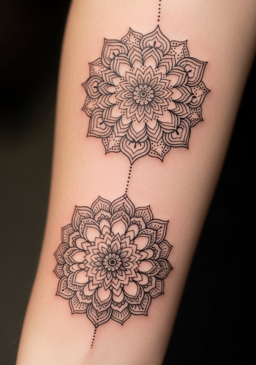
Place three medallions down the arm and give each one at least a finger-width of negative space, and the sleeve reads like a statement necklace. Use dotwork fill at roughly 60 percent density for soft transitions and keep outer petals at 0.5 mm line weight so they stay legible years out. This feels balanced and works for someone wanting a feminine or neutral aesthetic. For a budget option, plan two sessions: one for linework, one for dot shading. If you want a product to soothe, try fragrance-free healing balm.
Mistake to Avoid: Filling every gap with tiny motifs that compete with the medallions.
3. Geometric Lattice With Fine Dot Shading
A lattice pattern uses repeated shapes to create a textile-like texture. I ask artists to keep intersection lines at 0.45 to 0.6 mm and to use stippling gradients to suggest depth instead of solid black fills. The effect is modern and breathable, ideal for someone who wants a sleeve that reads minimal from a distance. This technique ages well if the artist spaces dots so they are 0.7 mm apart at most. A fine-line machine and single needles help keep session time down. For touch-ups and tattoo-safe sun protection, consider broad-spectrum mineral sunscreen for tattoos.
Mistake to Avoid: Asking for perfectly identical repeats, which look mechanical rather than hand-drawn.
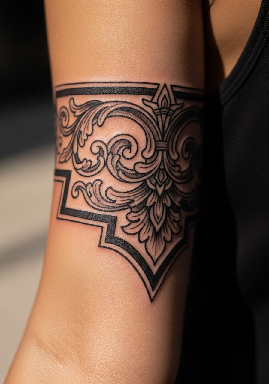
4. Ornamental Cuff Into Floral Flow
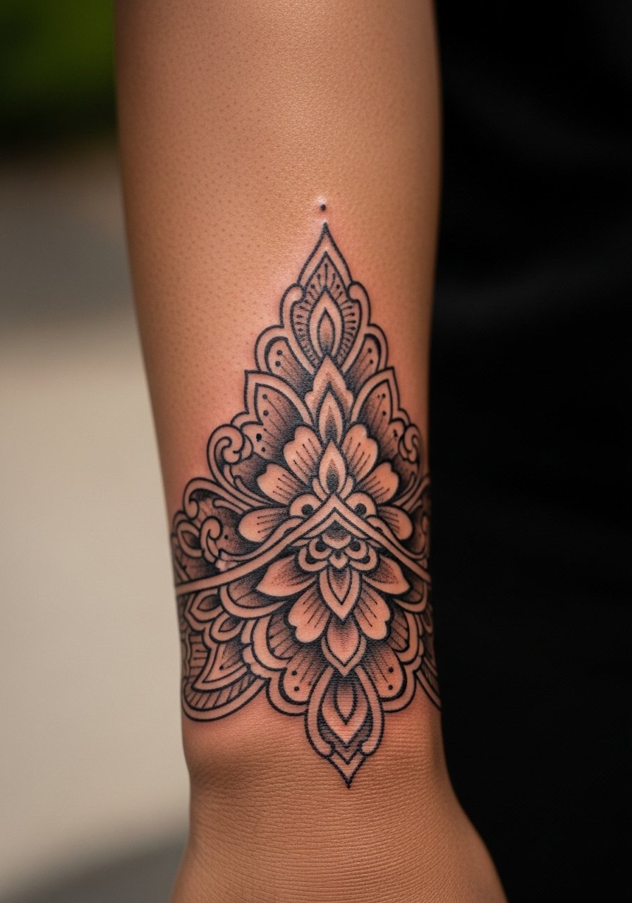
Start with a decorative cuff at the wrist and let stylized flowers grow upward, using the cuff as an anchor. The cuff can be dense linework at 0.7 mm with the flowers using softer 0.4 mm lines and light shading. This combo looks intentional, and it is a good option if you want the lower arm more detailed and the upper arm lighter. It suits someone who wants a balance of bold and delicate and who needs parts to be coverable under long sleeves. Add a low-cost option by spacing sessions for cuff then florals.
Mistake to Avoid: Making the cuff too heavy relative to the rest, which makes the top look unfinished.
5. Henna-Inspired Vine Wrap
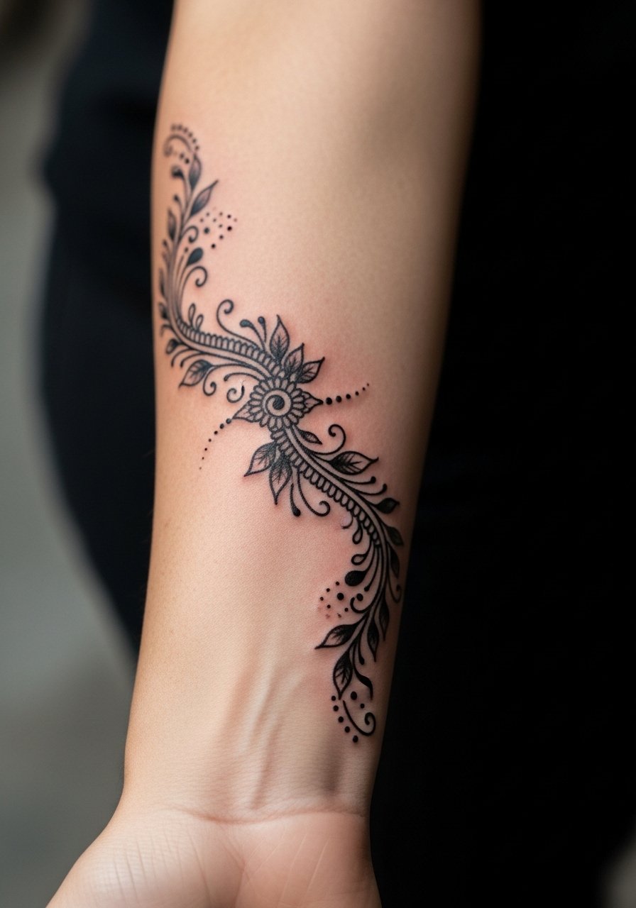
Henna motifs translate well to permanent ink when the artist simplifies complex lace into clear negative-space patterns. Request 0.35 mm fine lines on vines and slightly thicker accents for nodes. This creates movement and a lighter feeling than an all-over sleeve. Note cultural-sensitivity when borrowing specific cultural symbols; pick ornamental elements that are clearly ornamental rather than sacred. This suits someone who wants a delicate look and lower pain since much of it is thin linework.
Mistake to Avoid: Copying sacred motifs without asking about their meaning or context.
6. Baroque Scrolls With Subtle Shading
Baroque scrolls give a dramatic, vintage feel when you keep shadows soft. Request shading at 20 to 30 percent gray wash, not solid black fills, and thicker anchor lines at 0.8 to 1.0 mm. The result reads as carved metal or filigree. This is a higher-skill design, so budget more time for the first session. It is great for someone who likes a theatrical but wearable sleeve. For aftercare during healing pick a gentle, pH-balanced wash like mild tattoo cleanser.
Mistake to Avoid: Asking for heavy black fills in the shadows, which dulls the delicate scroll detail.
7. Jewelry-Ink Cuff That Matches Real Rings
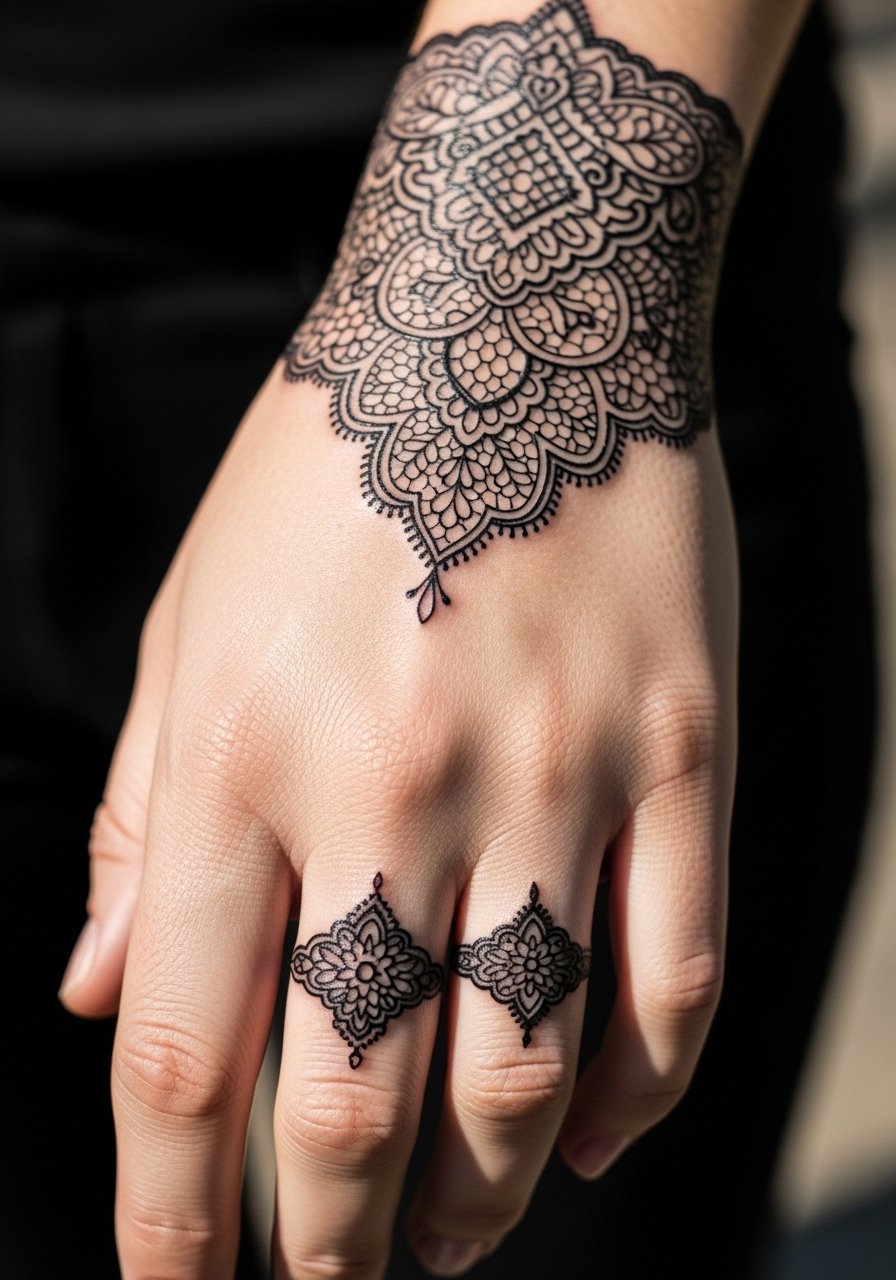
Design the cuff to mimic real jewelry by aligning anchor points with wrist bones and using negative space to suggest links. Pairing a small ring motif near the hand makes the sleeve look like part of your accessories. This is ideal if you want a sleeve that mixes with actual jewelry and is quick to conceal. It also gives an option for someone who wants a single-session addition. For matching care, consider lightweight tattoo-safe moisturizer.
Mistake to Avoid: Centering the cuff too high so it disappears under short sleeves.
If any of these feel ready to try, here are the tools and products I come back to when planning or healing a sleeve.
Supplies For Ornamental Sleeves
Basic Aftercare:
- Unscented tattoo aftercare salve (~$8-15). Use sparingly during the first week.
- Mild tattoo cleanser (~$7-12). Gentle, soap-free wash.
Protection & Maintenance:
- Mineral sunscreen for tattoos (~$10-18). Reapply after the tattoo fully heals.
- Lightweight tattoo moisturizer (~$8-14).
Studio Prep:
- Disposable stencil transfer paper (~$12-20). Handy if your artist works with custom stencils.
- Barrier film rolls (~$10-20). For keeping workstations clean when you are booking a home consult.
Tools for Touch-Ups and Care:
- Tattoo-safe bandages (~$12-20). For short-term protection.
- Precision ointment applicator (~$6-10). Helps put a thin layer of balm without overdoing it.
- Soft compression sleeve (~$8-15). Useful for sun protection during long recovery walks.
8. Dotwork Gradient Sleeve
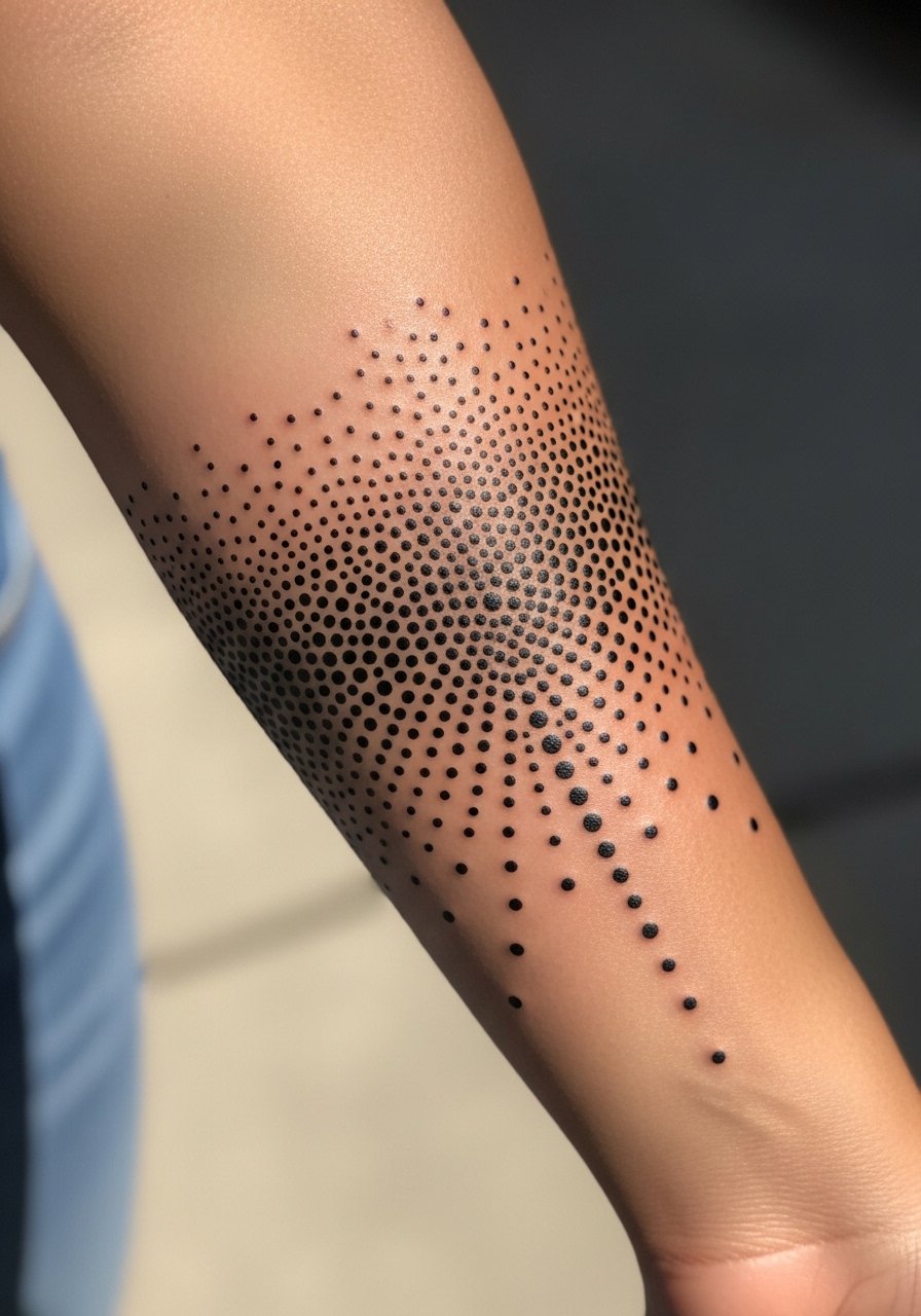
Dotwork gradients let the skin show through and age gracefully when done with intentional spacing. Tell the artist you want a dot density that reduces by roughly 10 percent per inch as it moves outward to keep a natural fade. This is meditative to watch and fits someone who prefers texture over heavy linework. Technique-wise, a single-needle or very small mag is best and session times can be long if you want dense dot regions. For healing use a thin layer of fragrance-free healing balm.
Mistake to Avoid: Starting the density too high so dots merge into a gray blotch.
9. Lace Panel With Skin Gaps
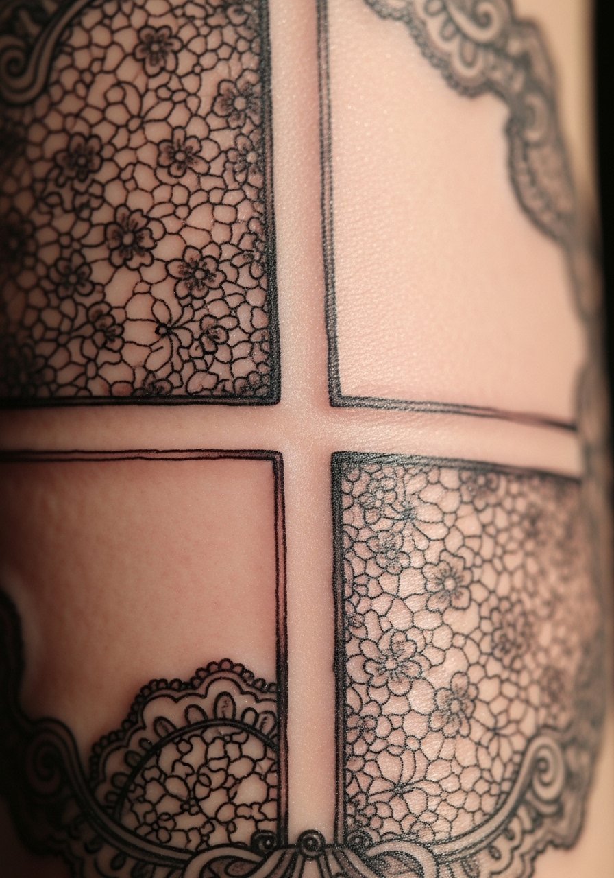
Panels of lace separated by untouched skin create a modern take on ornamental sleeves. The visual trick is to treat each panel as its own small composition with edge lines at 0.4 mm and interior filigree at 0.3 mm. This keeps sessions manageable and makes future additions simple. It is a good renter-friendly sleeve if you want parts that can be covered or shown selectively. Keep in mind cultural motifs; avoid using sacred symbols as decorative flourishes.
Mistake to Avoid: Letting panel borders touch, which makes the lace read as a single heavy block.
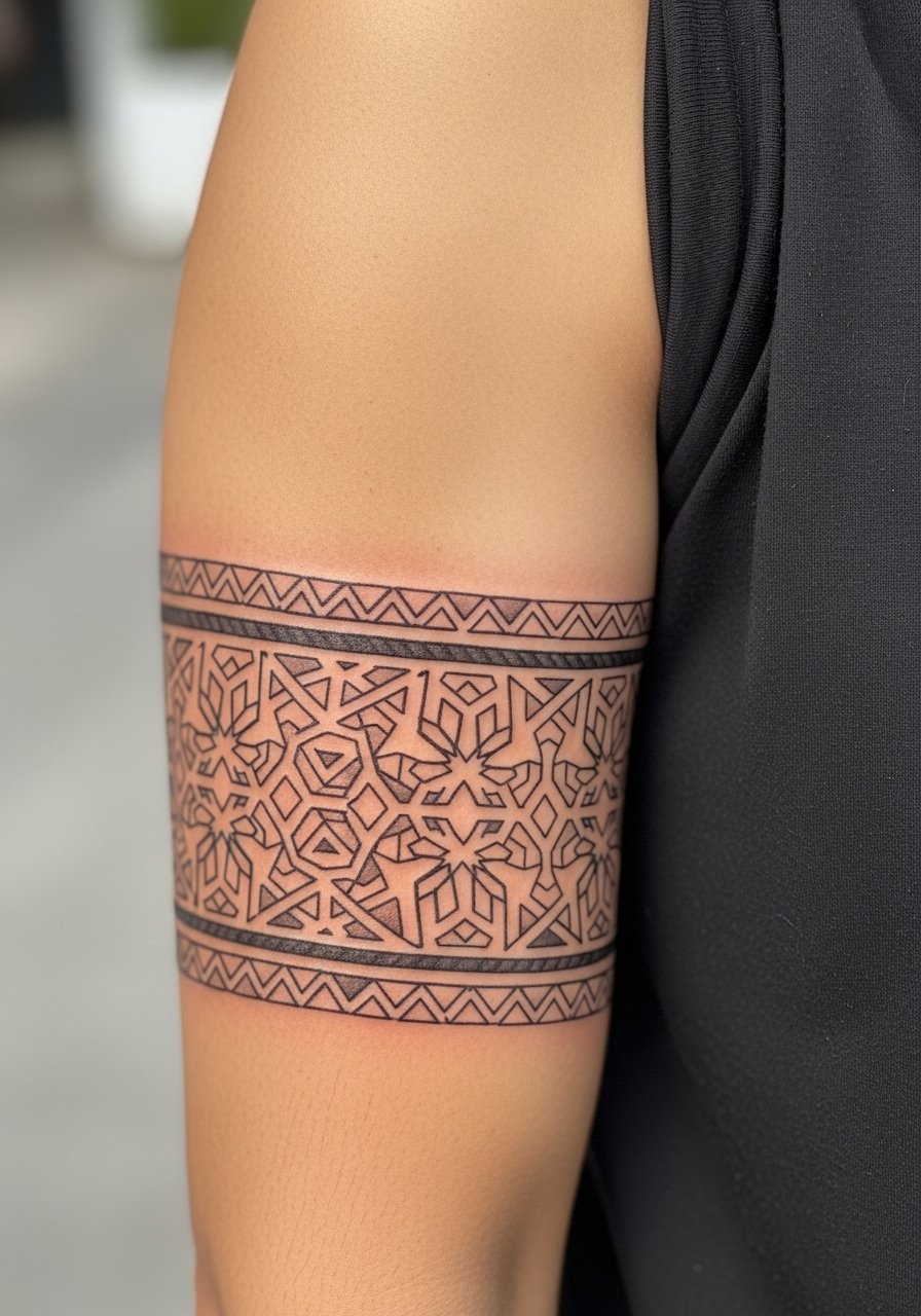
10. Symmetrical Compass Bands
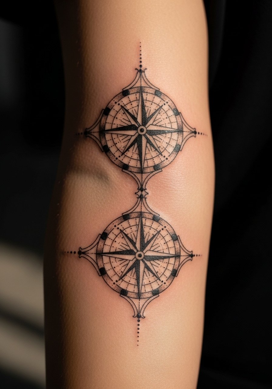
Using compass medallions spaced evenly creates a directional rhythm, so the arm reads as intentional movement. Ask for center points aligned with anatomical markers, and request line weights of 0.5 mm for outer points and 0.3 mm for internal details. This suits someone who wants structure and repeatability and it photographs cleanly. Plan two sessions if you want mirrored symmetry checked. For moisturizing during long healing nights pick lightweight tattoo moisturizer.
Mistake to Avoid: Relying on visual symmetry without measured reference, which leads to off-center medallions.
11. Ornamental Flame Motifs That Move
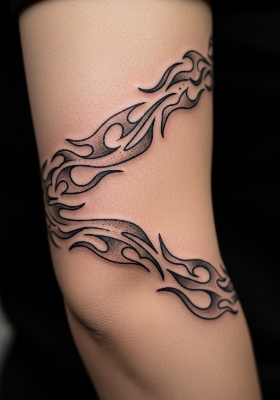
Stylized flame forms can be ornamental when drawn with flowing lines and negative space to imply motion. Keep the curve radii consistent and line tapering from 0.6 mm down to 0.3 mm. This idea works for someone who wants dynamic shapes that still remain ornamental and not overtly symbolic. The elbow area needs care during healing because motion can scab more easily. Use a thin protective layer of unscented tattoo aftercare salve and avoid tight clothing for the first week.
Mistake to Avoid: Putting too much shading in the crease, which leads to heavy scabbing and loss of detail.
12. Delicate Chain Link Sleeve
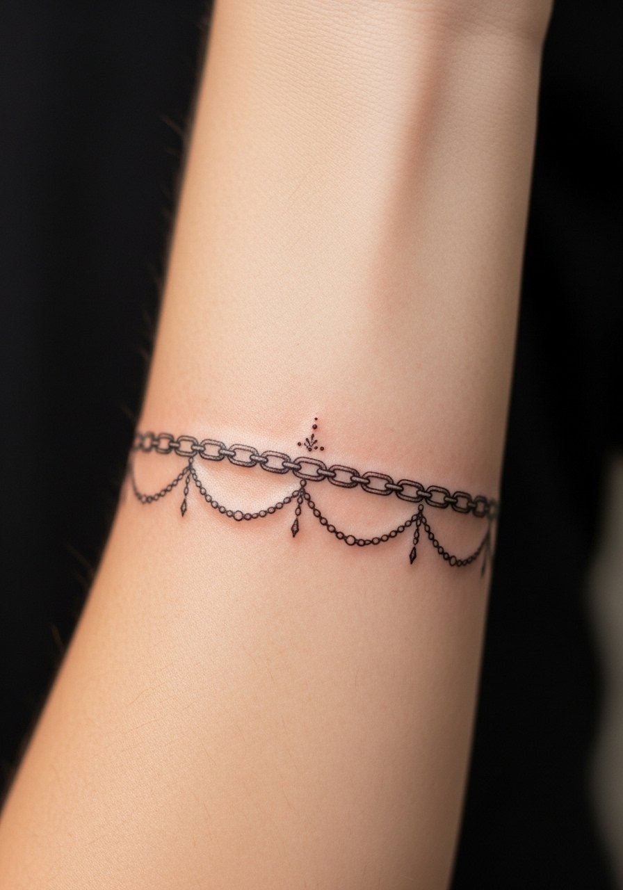
A chain link motif reads like jewelry and adapts to wrist, forearm, and upper arm. Use 0.4 mm anchor lines and add tiny connecting dots for realism. This is low-profile and suits someone who wants something coverable and low-maintenance. It is also quick to touch up if a link softens over time. Keep sessions short and focused if you are budget-conscious. For sun protection after healing use mineral sunscreen for tattoos.
Mistake to Avoid: Making links too tight so they appear fused after skin settles.
13. Architectural Column Motifs
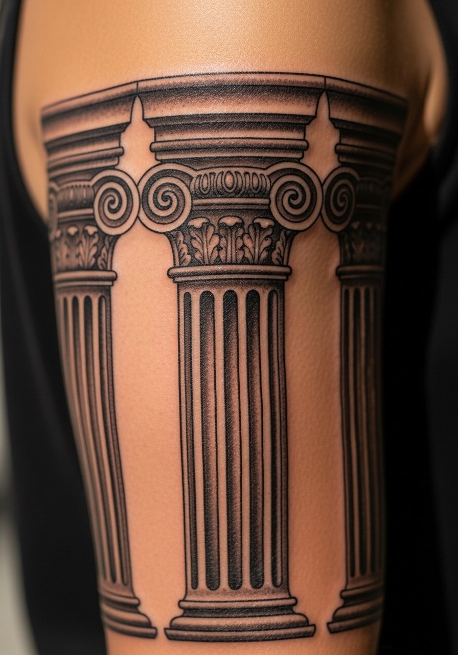
Architectural motifs give a sleeve a structured backbone. Bold verticals at 0.8 mm and thinner decorative fluting at 0.35 mm create a convincing architectural feel. This works well for someone who likes classical balance and its lines help the arm look elongated in photos. Because the design is linear, it holds up well to aging and only needs occasional touch-ups. If you plan to travel with your new sleeve, pack tattoo-safe bandages for immediate coverage after sessions.
Mistake to Avoid: Ignoring muscle curves, which makes straight columns look warped in motion.
14. Repeating Petal Scales For Subtle Coverage
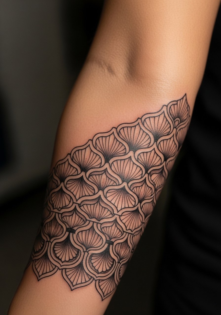
Petal-scale patterns create a soft scale texture without heavy contrast. Keep petal outlines thin at 0.3 to 0.4 mm and use 10 to 15 percent gray wash in the lower halves for depth. This fills space economically and reads textile-like, making it ideal if you want chest or back pieces to eventually connect. It is also a lower-pain option given light shading. For home care during peeling phases use mild tattoo cleanser.
Mistake to Avoid: Making petals identical with no variation, which flattens the whole sleeve.
15. Ornamental Band That Ages Intentionally
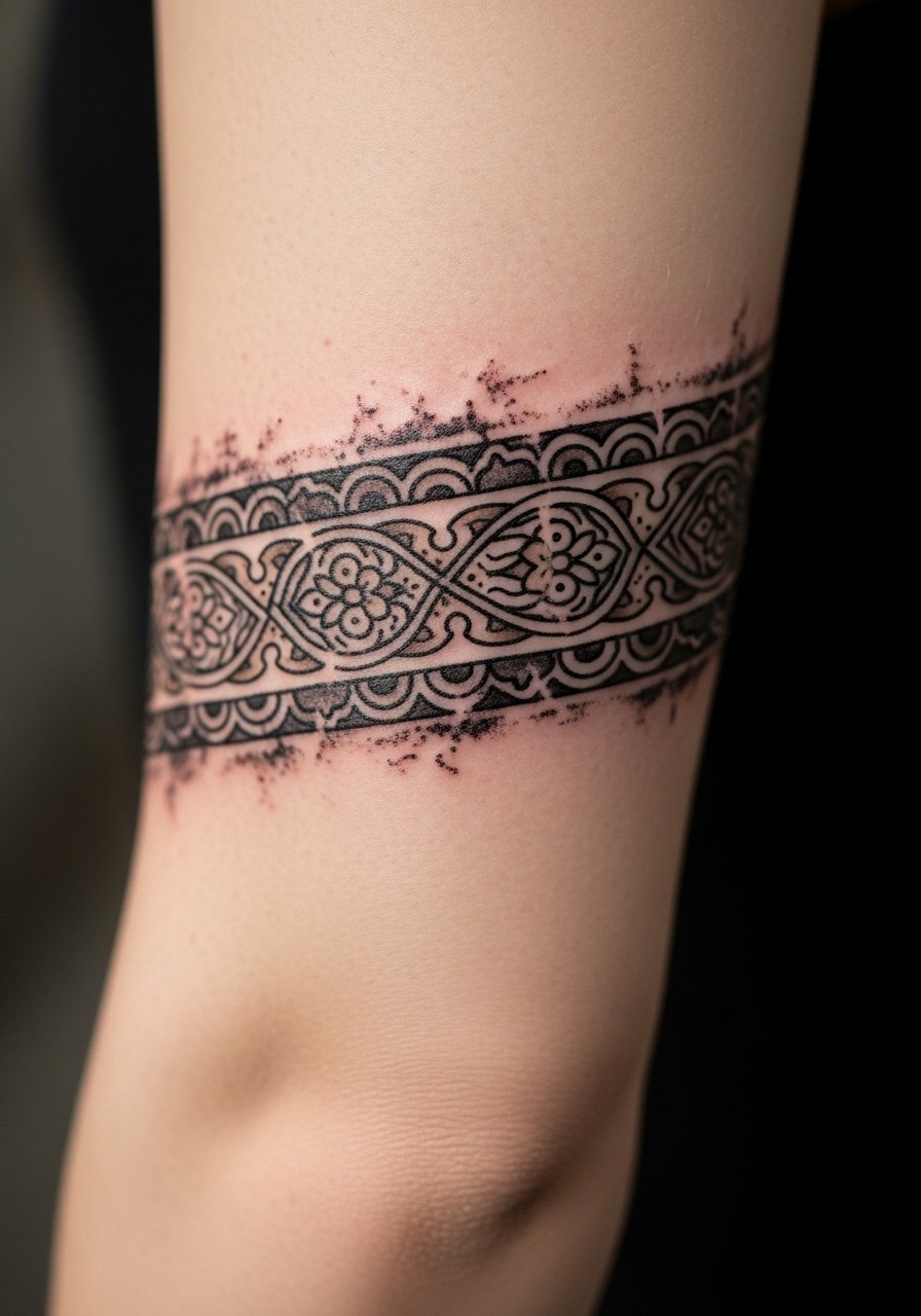
Some sleeves are designed to age with character. Ask for slightly irregular edges and softer shading around outer lines so the piece softens gracefully. Use a mix of 0.4 and 0.7 mm lines and request that artists leave intentional breathing room between major motifs. This approach is great if you want an old-silver look and do not mind periodic touch-ups. It is a higher-skill idea that benefits from an artist who understands long-term healing.
Mistake to Avoid: Asking for premature distressing that looks like bad work instead of intentional aging.
Long-Term Sleeve Care Habits
Keep sunscreen handy. Apply mineral sunscreen for tattoos to exposed ink after it fully heals. UV is the fastest way ornamental lines lose contrast.
Rotate moisturizers. I alternate between lightweight tattoo moisturizer and a salve depending on seasons, which prevents flaking in winter and greasiness in summer.
If a detail softens, small touch-ups work better than large recolors. Ask your artist to map the exact lines they will retouch and book a short session rather than trying to fix everything at once with heavy shading.
Give fresh sessions movement-friendly clothing. A soft compression sleeve or loose long sleeve protects new work without rubbing. Keep a pack of soft compression sleeve on hand for travel days.