
Afternoon light hit the sofa and suddenly the whole living room made sense, but it took me months to get there. For a long time I chased glossy catalog shots and ended up with a flat, busy space. One small change at a time fixed it, and the mix of warm paint, layered lighting, and scaled textiles is what finally stuck.
These ideas are not a mood-board checklist. They are practical moves you can do in a weekend on a modest budget, or scale up if you own the place. After trying this in three rentals I learned which swaps are renter-friendly and which need commitment. Expect measurement rules, quick DIYs, and product picks that actually hold up with kids or pets.
1. Layered Lighting With Dimmable Controls
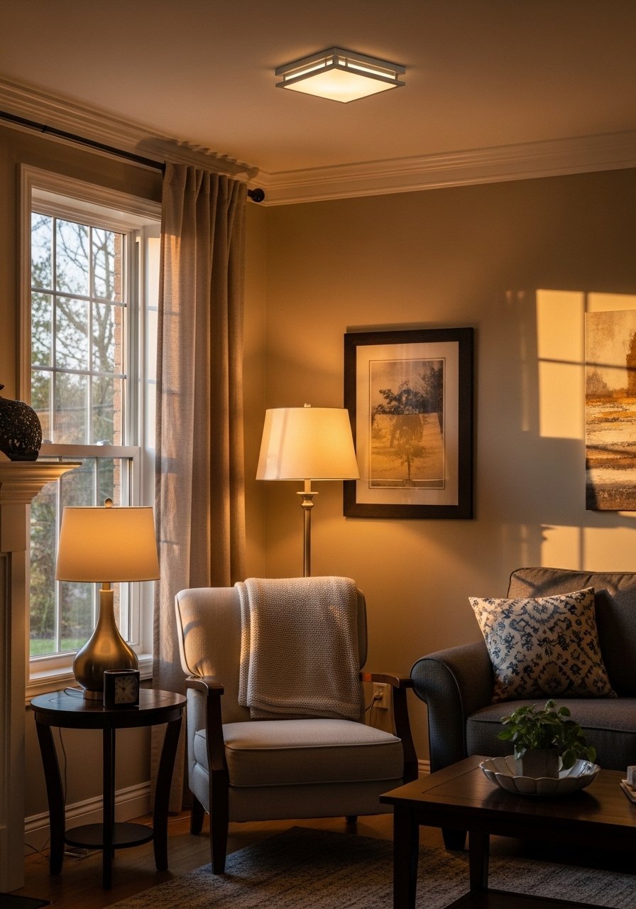
The living room that feels right always has three layers of light: ambient, task, accent. I aim for warm LED bulbs around 2700K in every lamp and a dimmer on the overhead to avoid glare. Swap a single overhead fixture for a dimmable LED can or a smart switch, and your evening scenes go from clinical to comfortable. For budget installs use smart dimmer switch and pair with warm LED bulbs. This works for renters too if you choose plug-in floor lamps and a plug-in dimmer.
Mistake to Avoid: Buying bright cool bulbs and hoping lamps fix the glare.
2. Swap Gloss For Warm Matte Paint
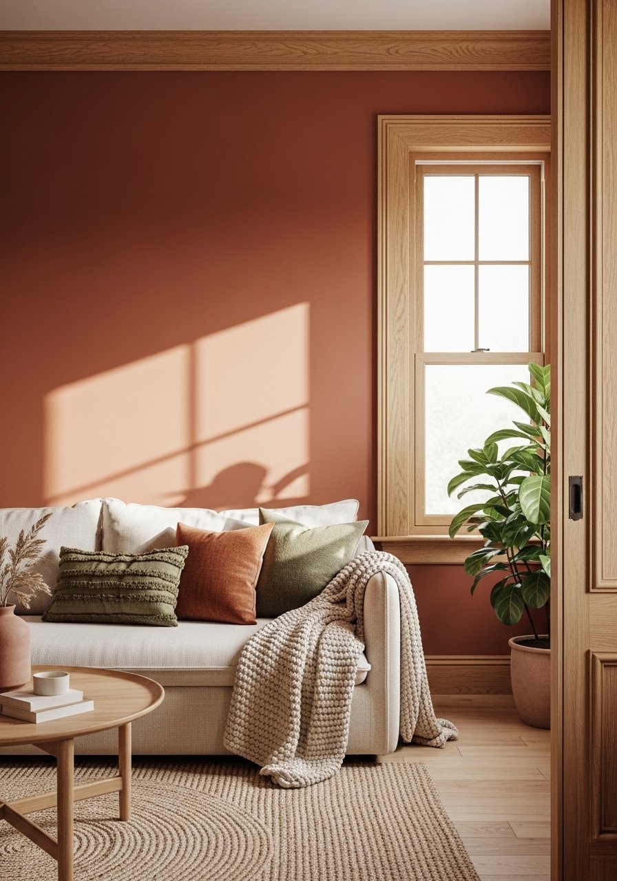
Matte or low-sheen paint hides small wall flaws and reads warmer in photos than high-gloss finishes. I patch, sand lightly, then use two thin coats for full coverage instead of one heavy one. A satin on trim keeps it washable. Try a sample and live with it on one wall for a week. I used matte wall paint sample to be sure before committing. For rental walls, peel-and-stick paint alternatives and removable wallpaper are good hacks when repainting is off the table.
Mistake to Avoid: Rolling one thick coat and expecting a smooth, even finish.
3. Rug Two-Thirds Rule To Anchor Seating
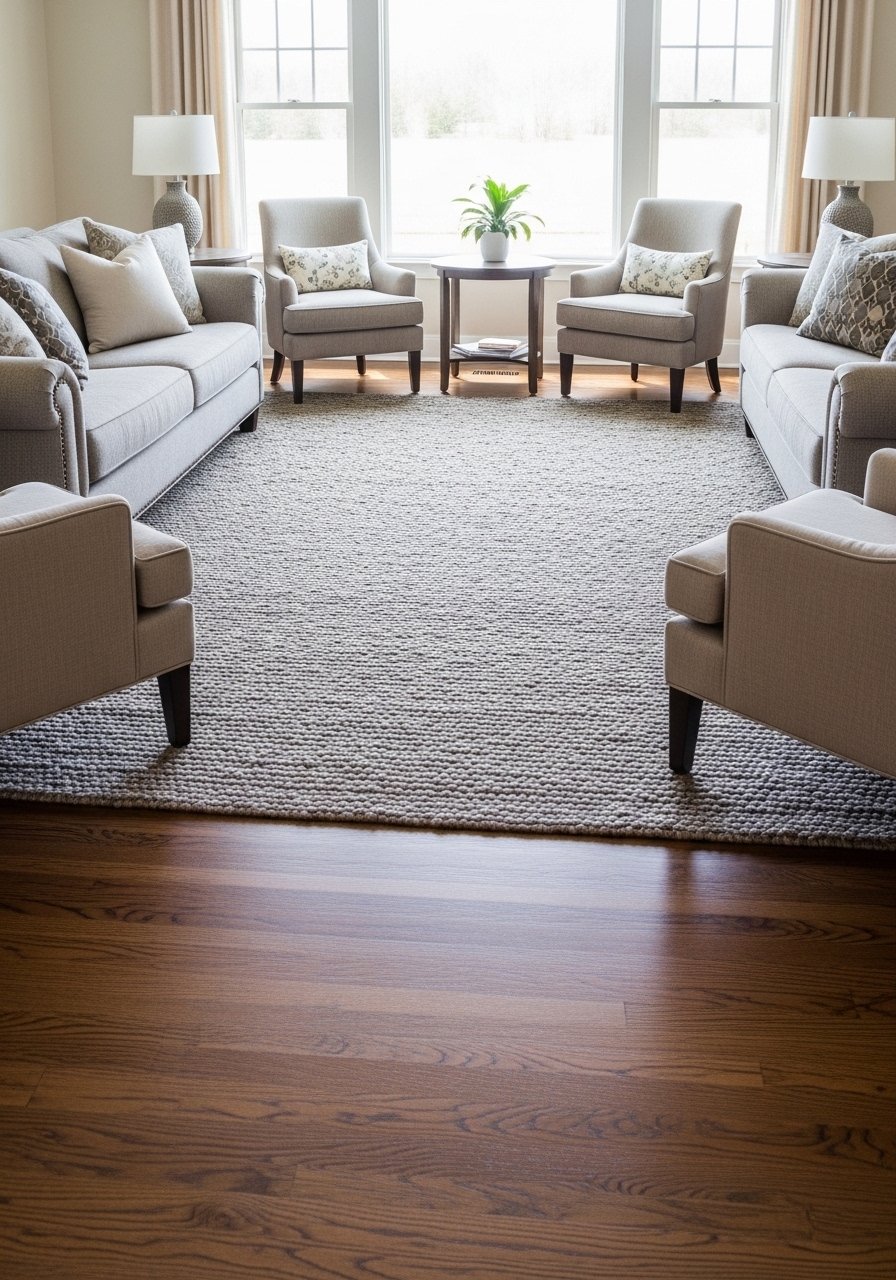
Rugs that are too small make a room feel disconnected. Aim for a rug that takes up roughly two-thirds of the seating area so the front legs of sofas and chairs sit on it. Add a non-slip rug pad under to keep it flat and protect floors. A neutral textured rug grounds color and hides traffic marks. For small rooms push the rug to meet furniture edges, and for open plans use rugs to define zones clearly.
Mistake to Avoid: Choosing a rug that only sits under the coffee table and leaves seating floating.
4. Curated Open Shelving That Breathes
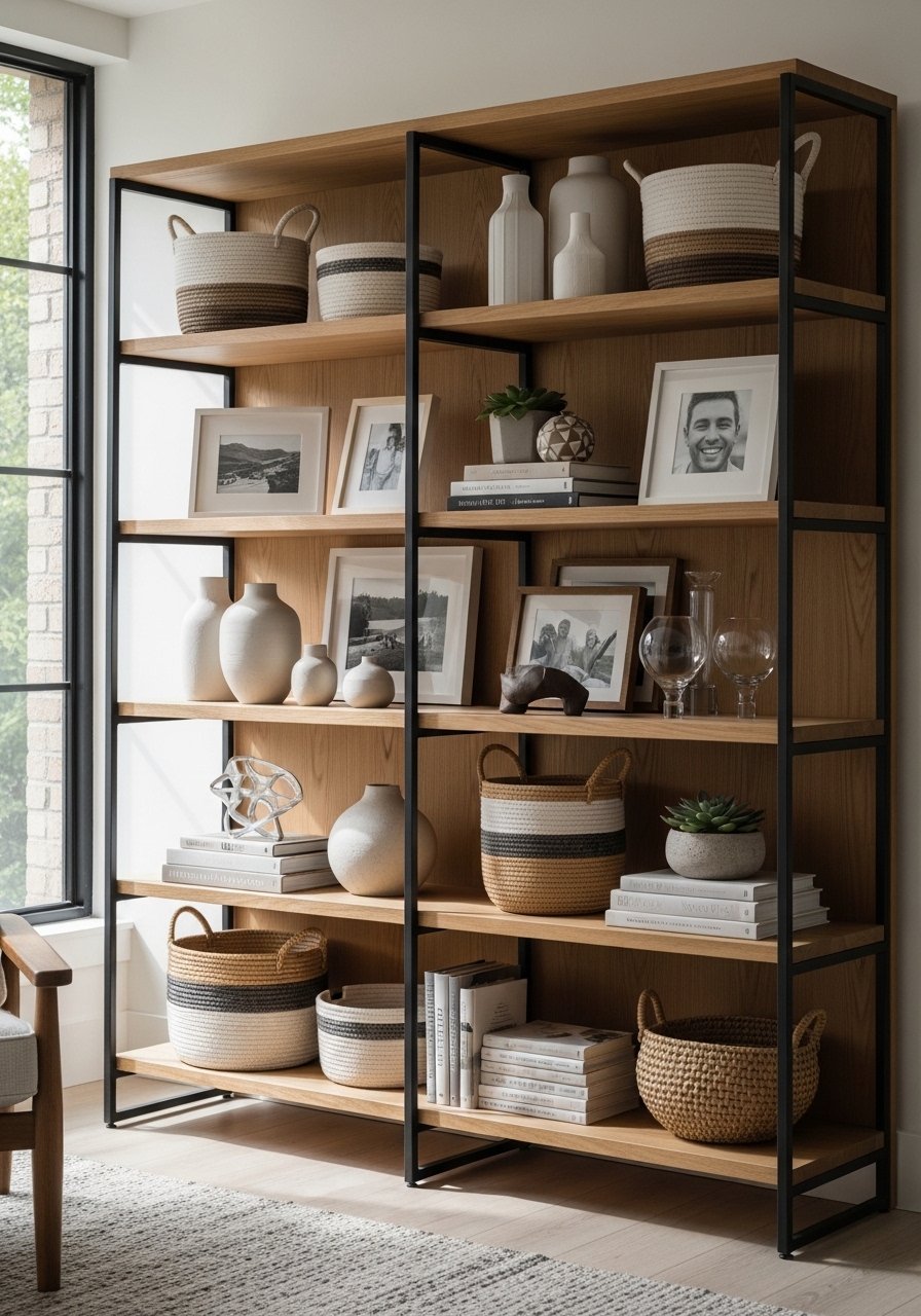
Open shelves look cluttered fast unless you balance objects and space. Group items in threes, mix horizontal book stacks with vertical pieces, and tuck away small items in a woven storage basket. Leave at least one shelf breadth of emptiness per bookcase to avoid the thrift-store effect. Swap matchy knickknacks for a couple of larger sculptural pieces that give scale. This approach is low cost and renter-friendly since nothing requires permanent mounting.
Mistake to Avoid: Filling every inch of shelving because empty shelves feel unfinished.
5. Gallery Wall With Proper Scale and Spacing
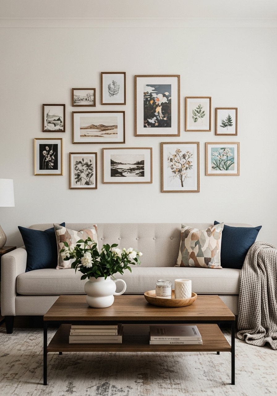
Gallery walls work when you plan scale and center. Hang the center of the whole composition at about 57 inches from the floor, keep spacing tight at two to three inches, and balance large pieces with clusters of small ones. I trace frames on kraft paper and tape them up to test layouts. Use matching frames like black metal picture frames for cohesion. The result feels deliberate instead of slapped-together.
Mistake to Avoid: Hanging pieces too high or with inconsistent spacing that breaks the visual flow.
6. Curtains Hung High And Wide
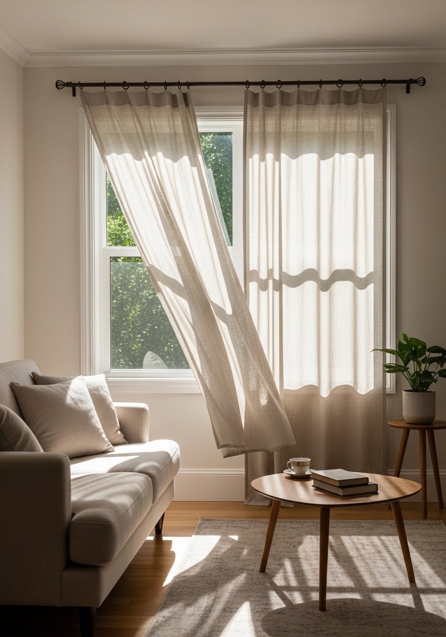
Pull curtains a little higher and wider than the window. Mount the rod 4 to 6 inches above the frame and extend brackets 8 to 12 inches past the jamb for more light and bigger proportion. Use lightweight linen curtain panels that skim the floor for a tailored look. For renters, tension rods or clip rings make the job reversible. Properly hung curtains make even a modest window read grand.
Mistake to Avoid: Mounting rods inside the frame which visually shrinks windows.
7. Entry Console That Works Hard
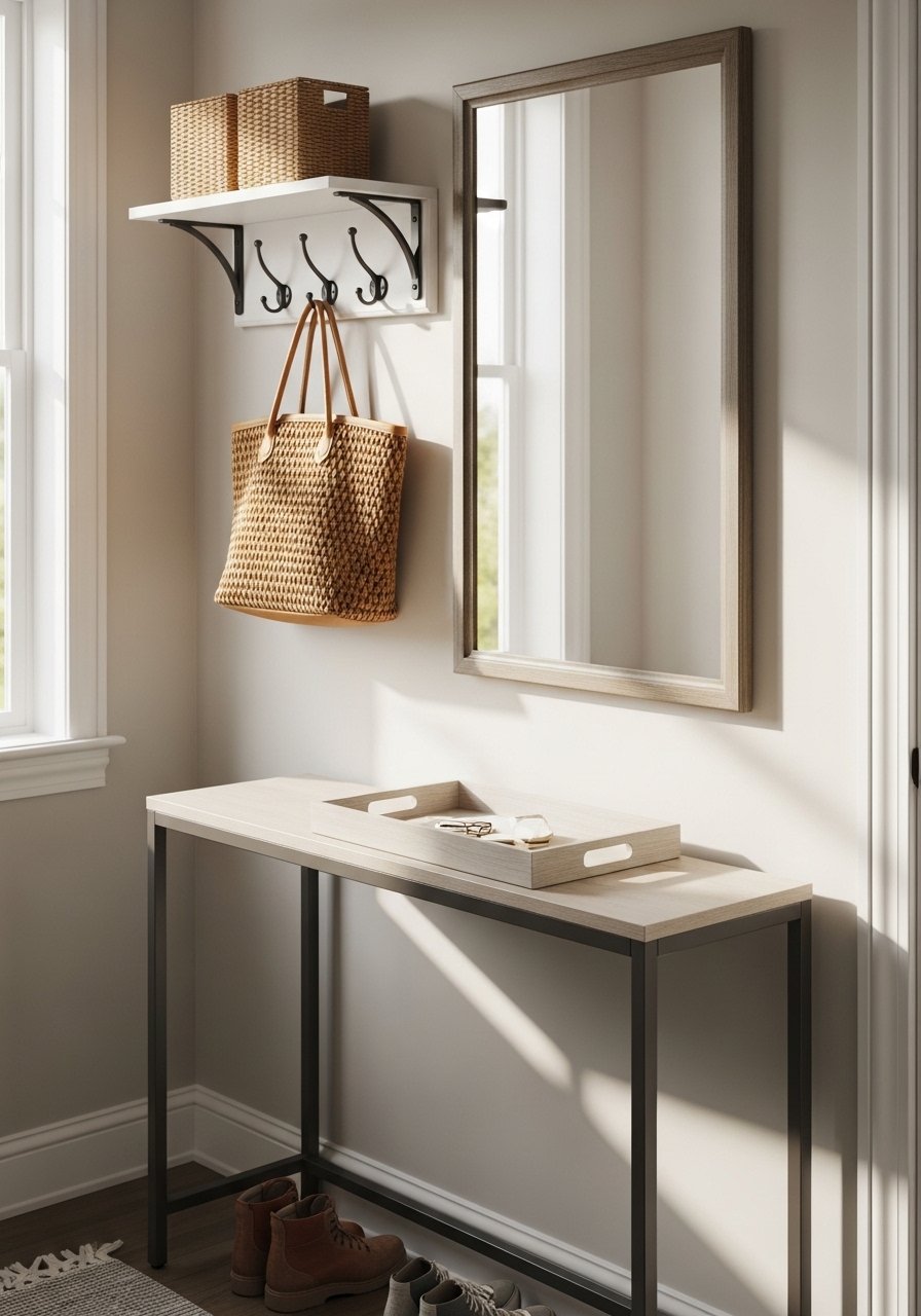
An entry needs a landing spot for day-to-day items that still feels tidy. Choose a narrow console with a drawer or a simple shelf below for baskets, add a shallow tray for keys, and a low mirror so you can grab sunglasses at the last minute. A wood entry tray and a set of wall hooks upgrade function without fuss. This small investment saves five daily micro-moments of panic when leaving the house.
Mistake to Avoid: Using an oversized console that blocks traffic in a narrow entry.
If any of these ideas have you ready to actually make a change, here are the main things I reach for across most of them.
Living Room Starter Picks
Lighting & Electrical:
- Smart dimmer switch (~$30-60). Swap this for hardwired ambient control.
- Warm LED bulbs (~$15-25 for a 4-pack).
Textiles & Soft Goods:
- Textured area rug (~$120-300). A neutral base saves future redecoration.
- Linen curtain panels (~$30-60 per panel).
Storage & Styling:
- Woven storage basket (~$25-45). Great for throws and kid gear.
- Black picture frames (~$20-50). Cohesive frames simplify gallery walls.
8. Storage Bench That Doubles As Seating
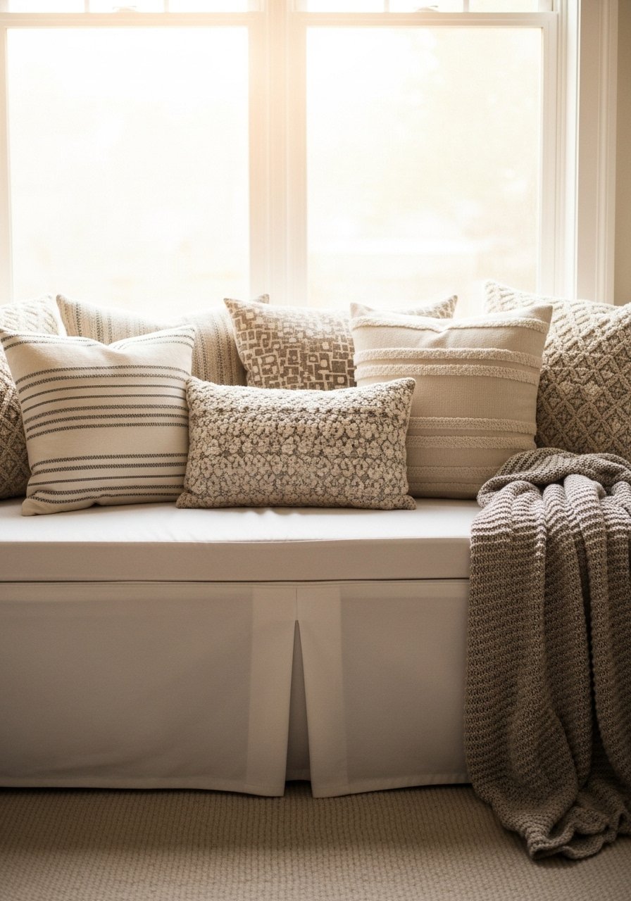
A storage bench is an easy anchor for a small room or entry. Look for one with a removable slipcover for washing, or improvise with a bench cushion and baskets underneath. I keep a folded throw inside for impromptu guests. In rentals choose a piece that can be wall-secured but not permanently mounted. Pair with a storage bench and an inexpensive washable cushion cover to keep the look fresh.
Mistake to Avoid: Buying a delicate upholstered bench that stains instantly in a busy household.
9. Put Statement Lighting Where You Least Expect It
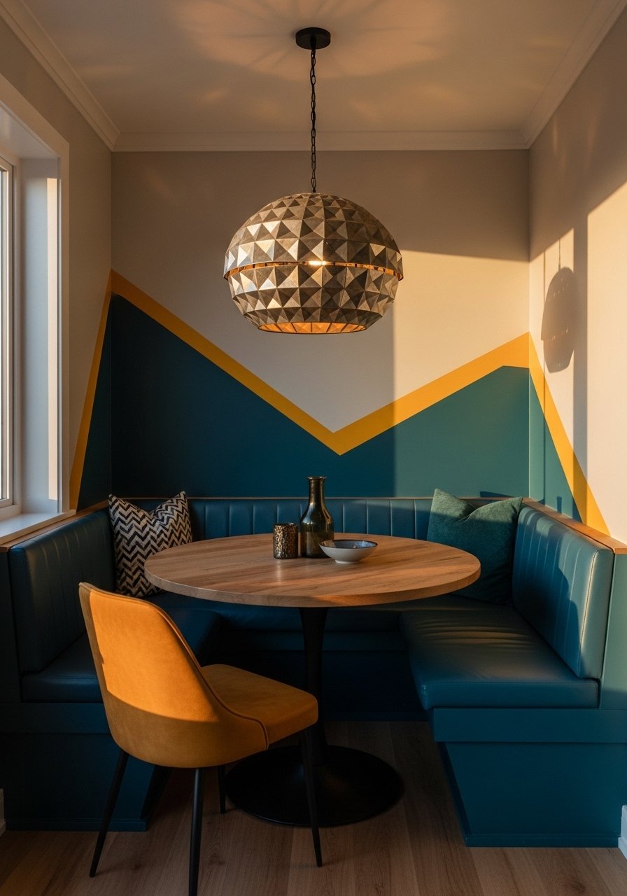
Big lighting does not only belong in the center of the room. A sculptural pendant over a reading nook or an oversized sconce by a bookshelf creates intentional focus. Keep scale in mind, aim for pendants that sit about 30 to 36 inches above a table surface. I swapped a small fixture for a statement pendant light in a corner and the room gained personality without extra furniture. For renters pick plug-in fixtures or take the pendant when you go.
Mistake to Avoid: Choosing a small lamp for a big space and hoping it reads like design.
10. Green Corners With Low-Maintenance Plants
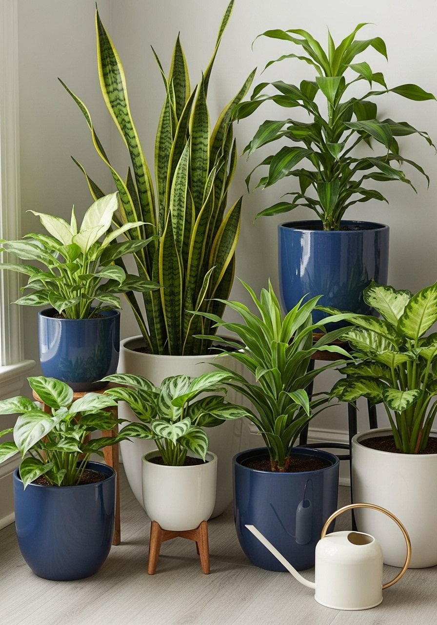
Plants bring texture and airiness. Mix real low-light houseplants like snake plants or pothos with a couple of lifelike faux pieces in spots that do not get consistent sun. Use planters at varied heights and a simple ceramic planter for visual layering. In homes with pets pick non-toxic varieties or place plants out of reach. A plant corner makes a room feel softer without requiring green-thumb levels of care.
Mistake to Avoid: Buying delicate tropicals for low-light corners and then forgetting them.
11. Texture Layering For Cozy, Not Cluttered
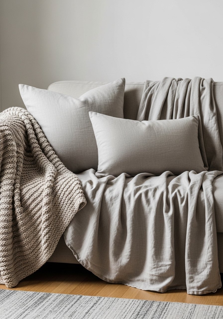
Texture is cheap and effective. Use a 3-to-1 ratio for pillow sizes to create depth, add a chunky knit throw and a smooth linen pillow to balance rough textures. Swap seasonal covers and use outdoor fabric for high-traffic seats. A neutral palette plus one accent material keeps the room feeling intentional. I grab a linen throw pillow cover and a chunky knit throw to refresh a sofa in minutes.
Mistake to Avoid: Layering too many competing textures so nothing reads clearly.
Real Room Quick Fixes
Thin coats beat one thick coat every time. Two thin coats of paint or stain are smoother than one heavy one. A paint sample helps avoid costly repaints.
Grab velvet pillow covers for about $12 each. Swapping pillow covers seasonally refreshes the room without new furniture.
Putting curtain rods higher makes windows look larger. A simple set of curtain rods with brackets lets you lift the look for little cost.
Most people buy too-small rugs. Try a slightly larger area rug than you think and add a rug pad to prevent slipping.
If you have pets, choose durable fabrics, like indoor-outdoor blends. An indoor-outdoor sofa cushion cover survives daily wear and still looks intentional.