
I almost threw out a dented thrift mirror because it looked sad against a bare wall, then I propped it above a narrow console and the entryway finally stopped feeling like a hallway. Little shifts like that—framing, layering, hiding cords—are what make a place look lived-in instead of staged. These are nine practical tweaks I used across three rentals to get rooms that feel edited but not precious.
These ideas are for renters and homeowners who want noticeable change without major work or big budgets. Most projects take under an afternoon and use common tools. Expect a mix of temporary fixes, small purchases, and one or two simple DIYs that read expensive because of proportion and placement, not price.
1. Leaned Mirror for Instant Depth
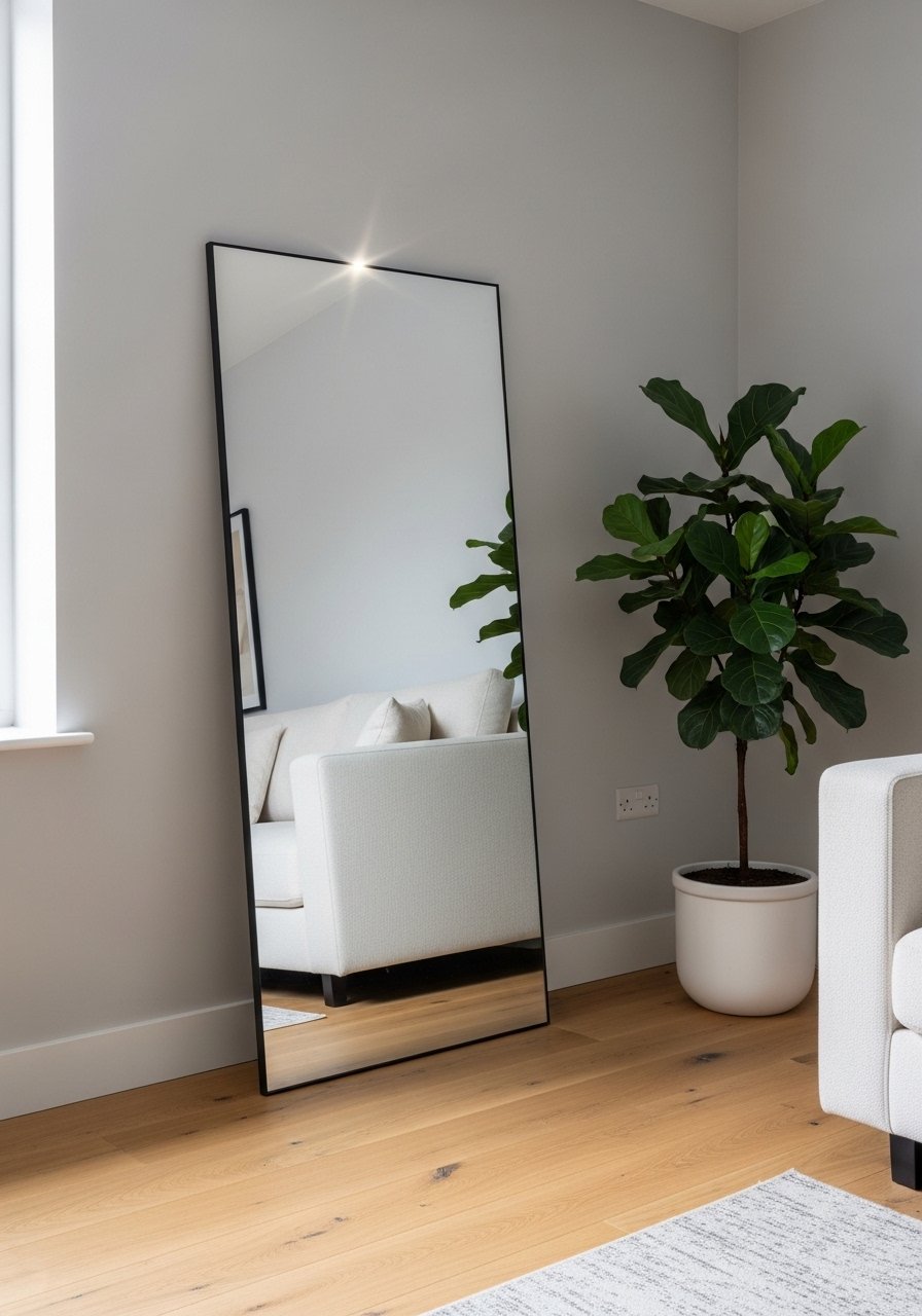
Leaning a mirror is a fast trick that reads like a room update. Visually it doubles light, enlarges sightlines, and hides a scuffed patch on the wall. Pick a mirror about two-thirds the height of the wall section it sits against, and angle it back 5 to 7 degrees so it reflects the room rather than the ceiling. For renters, secure it with two command strips at the top to keep it stable. If the frame feels too ornate, pair it with a simple woven basket nearby to balance scale and add texture.
Mistake to Avoid: Hanging the mirror flat against the wall so it reflects a boring ceiling instead of the room.
2. Low Rug, Big Impact

A rug that only sits under coffee table legs makes the seating feel disjointed. Pull the rug so the front legs of all seating are on it, even if that means choosing a rug slightly too small visually. Aim for 8 to 12 inches of rug showing in front of the sofa edge to keep proportions cozy. A jute or low-pile rug is forgiving with traffic and pets. I swapped in a jute rug that costs less than a premium wool piece and still grounds the room. For small rooms, layer a 4×6 on top of a larger neutral base to get pattern without commitment.
Mistake to Avoid: Choosing a rug that is tiny and floats in the middle of the room, creating visual islands.
3. Gallery Wall with Negative Space
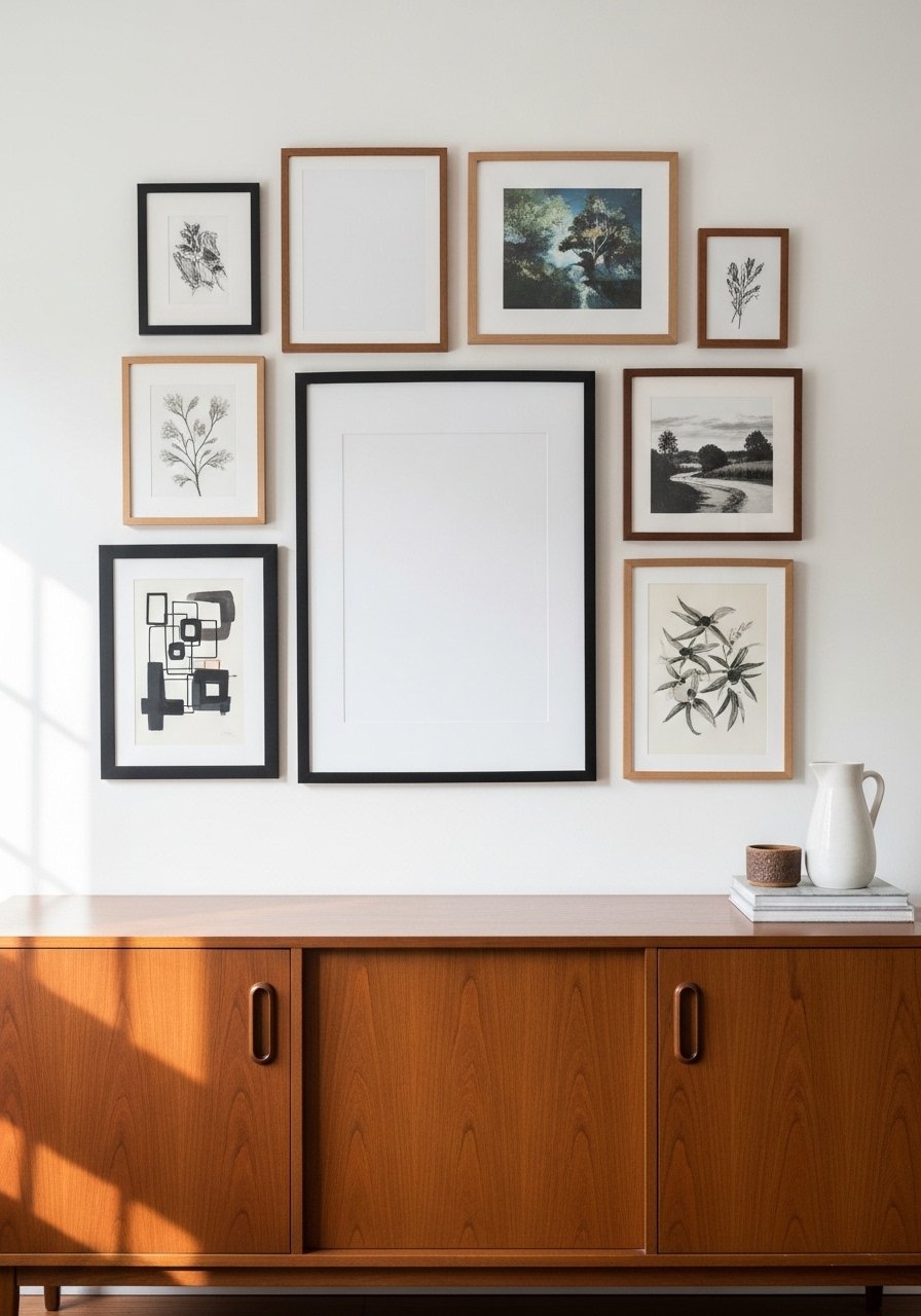
Gallery walls succeed when you plan spacing like furniture. Use 2 to 3 key pieces, then fill around them with smaller frames, keeping 2 to 3 inches between frames for a compact look or 4 to 6 inches for airier layouts. Lay frames on the floor and arrange until the group reads balanced, then measure a central horizontal line 50 to 60 inches from the floor as a guide. For thin frames, use a pair of black picture frames to create contrast. A blank mat in one frame keeps the wall from feeling like a collage and makes each piece count.
Mistake to Avoid: Hammering nails randomly and expecting the eye to forgive mismatched spacing.
4. Concealed Charging Station
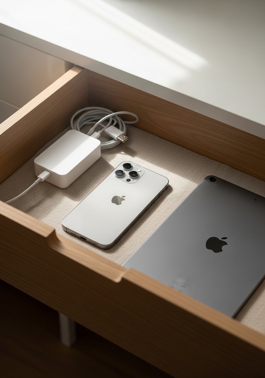
Visible chargers age a space quickly. Turn a drawer or a woven box into a charging station by drilling a small grommet hole in the back for cables and placing a slim power strip inside. Keep chargers tied with Velcro straps and label each cable with washi tape for quick swaps. I keep a compact power strip in the drawer and it handles phones, candles, and a lamp without a tangle. This trick is renter-friendly because nothing is permanently attached and it removes the visual clutter that makes a shelf look messy.
Mistake to Avoid: Running cords up the wall and behind frames so they peek out at odd angles.
5. Layered Lighting Plan
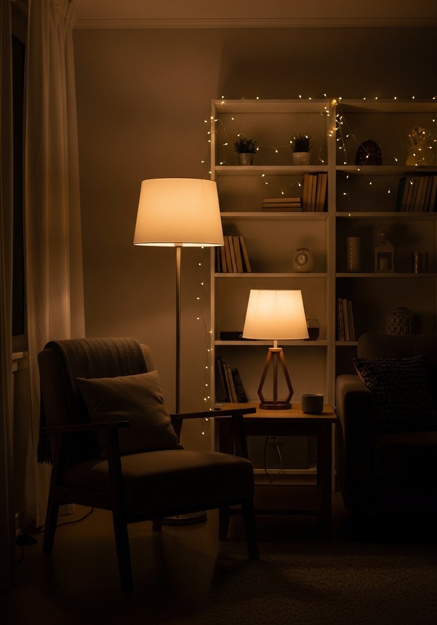
One overhead light does not a room make. Combine task, ambient, and accent lighting to create depth. A single table lamp plus a floor lamp gives at least three levels of light. Aim for bulbs between 2200K and 2700K for a warm, lived-in glow. Use a small ceramic table lamp on a console to add evening warmth without rewiring. Place accent lights to highlight texture or plants, not to spotlight every corner. I tried this in three rentals and the evenings suddenly felt intentional instead of cavernous.
Mistake to Avoid: Buying one bright overhead bulb and leaving it to flatten everything.
6. Floating Shelf Styling Rule
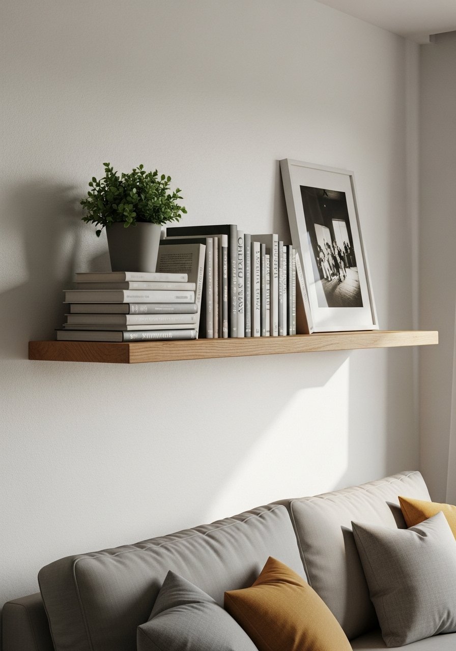
A floating shelf can read decorative or cluttered depending on scale. Start with a larger anchor object on one side, such as a vase or a trimmed stack of books, then balance with smaller items staggered in height. Leave about 20 to 30 percent empty space on the shelf to keep it from reading overcrowded. For renters, use wall anchors rated for the shelf size and secure it level. I often add a matte stoneware vase to add texture without fuss. Match the shelf depth to common objects so things do not overhang.
Mistake to Avoid: Filling the shelf edge to edge with small pieces that create visual noise.
7. Upholstery Refresh with Throws and Pillows

You do not need a new sofa to change the mood. Swap pillow covers seasonally and add one oversized cushion to anchor a reading spot. For scale, use two 18-inch pillows plus one oversized 24-inch square or a lumbar pillow. Swap heavier fabrics in winter and light linens in summer. I replaced worn cushion covers with a set of velvet pillow covers for under $15 each and the sofa looked fresher instantly. Mix a patterned cover with a plain one and a tactile knit to keep the result intentional.
Mistake to Avoid: Buying five small pillows that clutter the seat and make the sofa unusable.
If any of these ideas have you ready to try something, here are the main things I actually buy and reuse.
Room-Ready Shopping Picks
Textiles & Soft Goods:
- velvet pillow covers (~$12 each). Swap them seasonally to shift the room feel.
- jute rug (~$70-120). Durable, affordable texture that hides traffic.
Hardware & Tools:
- command-strips (~$6-12). For lightweight hanging without damage.
- compact-power-strip (~$18-30). Slim enough for drawers and behind consoles.
Accents & Lighting:
- ceramic-table-lamp (~$35-70). Soft light and surface interest.
- matte-stoneware-vase (~$20-40). Adds weight to shelves and consoles.
8. Concealed Storage with Decorative Bins

Open shelving can look neat when the lower shelves hide functional clutter. Use matching bins on the bottom row to store toys, cables, and off-season throws. Label the inside of each bin for quick sorting. For small spaces, pick shallow bins about 10 to 12 inches deep so they slide in and out easily. A woven storage basket adds texture and hides what you do not want on display. This approach makes shelves work double-duty in apartments where closed cabinets are limited.
Mistake to Avoid: Filling every shelf with untidy items and hoping the eye will ignore the chaos.
9. Faux Paneling with Simple Trim
You can get the architectural look of paneled walls without demolition. Nail or adhesive thin trim into a rectangular grid, caulk the seams, and paint the whole wall the same color for a subtle, elevated effect. Keep panels roughly 12 to 18 inches apart depending on wall width, and prime the trim first for cleaner lines. This is a renter-friendly version when you use removable adhesive or small nails and spackling to repair later. Use a quality paintable trim molding and matching touch-up paint to finish the look.
Mistake to Avoid: Using oversized panels that overpower the wall and make the room feel boxy.
Renter-Friendly Styling Moves
Thin coats beat one thick coat every time. When painting a trim accent, apply two thin layers of paint rather than one thick coat for a smoother finish and fewer drips. A small angled paint brush helps with neat edges.
Grab command-strips for temporary hangs. They hold light mirrors and art without drilling and save landlord conversations.
Plants survive best in bright indirect light, not window sills baking in afternoon sun. A self-watering planter cuts down on watering mistakes and keeps foliage healthy.
Most people buy many small baskets. One oversized woven storage basket anchors a corner better and hides more than three small ones combined.
Put one lamp on a dimmer and keep overheads on low for evenings. A plug-in dimmer switch is an easy addition that immediately softens a space.