
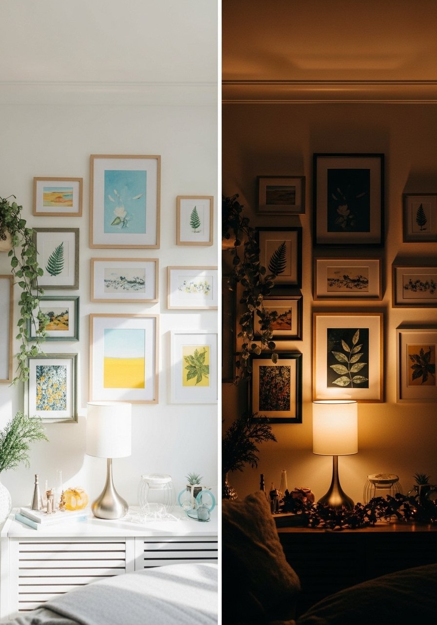
I kept moving frames around for weeks. Every time I thought the wall read "intentional" it actually looked crowded, like things were arguing for attention. The moment I set a consistent mat width, moved the centerline to 57 inches, and chose three repeatable frame sizes, the whole wall finally read like a single post instead of twenty competing ones.
These ideas lean renter-friendly and budget-minded, with a few mid-range pieces if you want them. Most setups take under an hour once you have a template, and many work on small walls or a full stair run. Most people spend somewhere between $500 and $800 when they finally commit to refreshing a room. After trying this in three rentals, I learned which shortcuts survive move day.
1. Grid Of Same-Sized Frames For Clean Symmetry
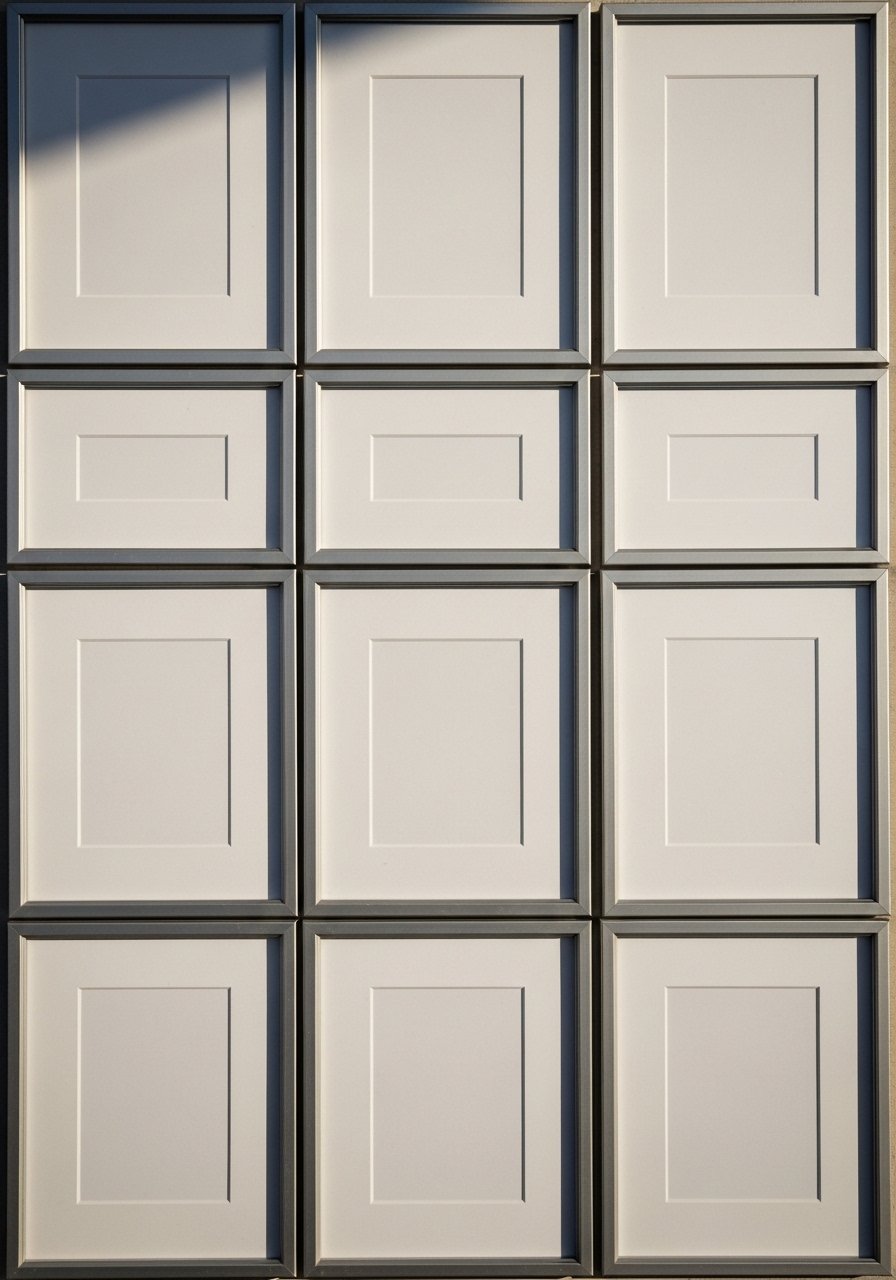
A strict grid is the easiest way to get an Instagram-ready result fast. Use identical frames, identical mat widths, and keep the spacing at 2 inches. It reads calm on camera because the eye finds rhythm. Works for prints, photos, or a mix if you keep color consistent. For renters, use adhesive picture hangers that hold 15 pounds so you avoid multiple drywall holes. Try black-8×10-frames-set-of-12 for a cheap, even look.
Mistake to Avoid: Hanging frames with uneven spacing makes a neat grid read sloppy and wonky.
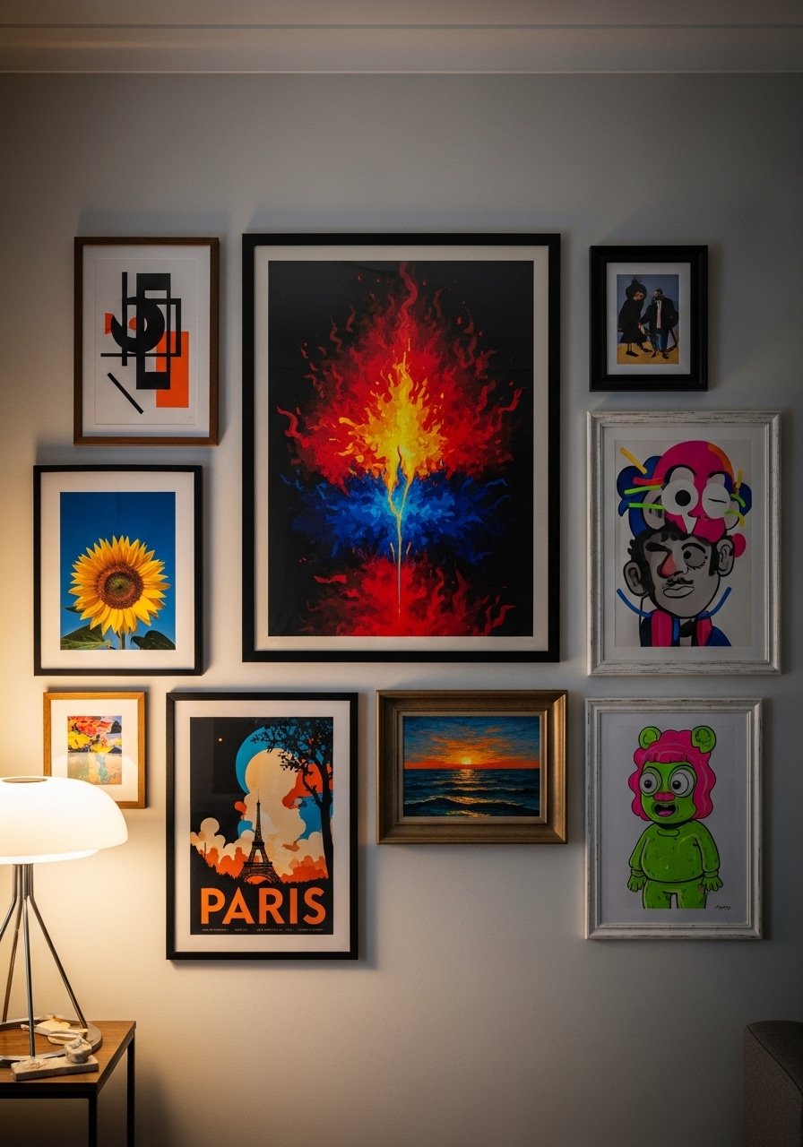
2. Salon-Style Mix With A Neutral Mat Ratio
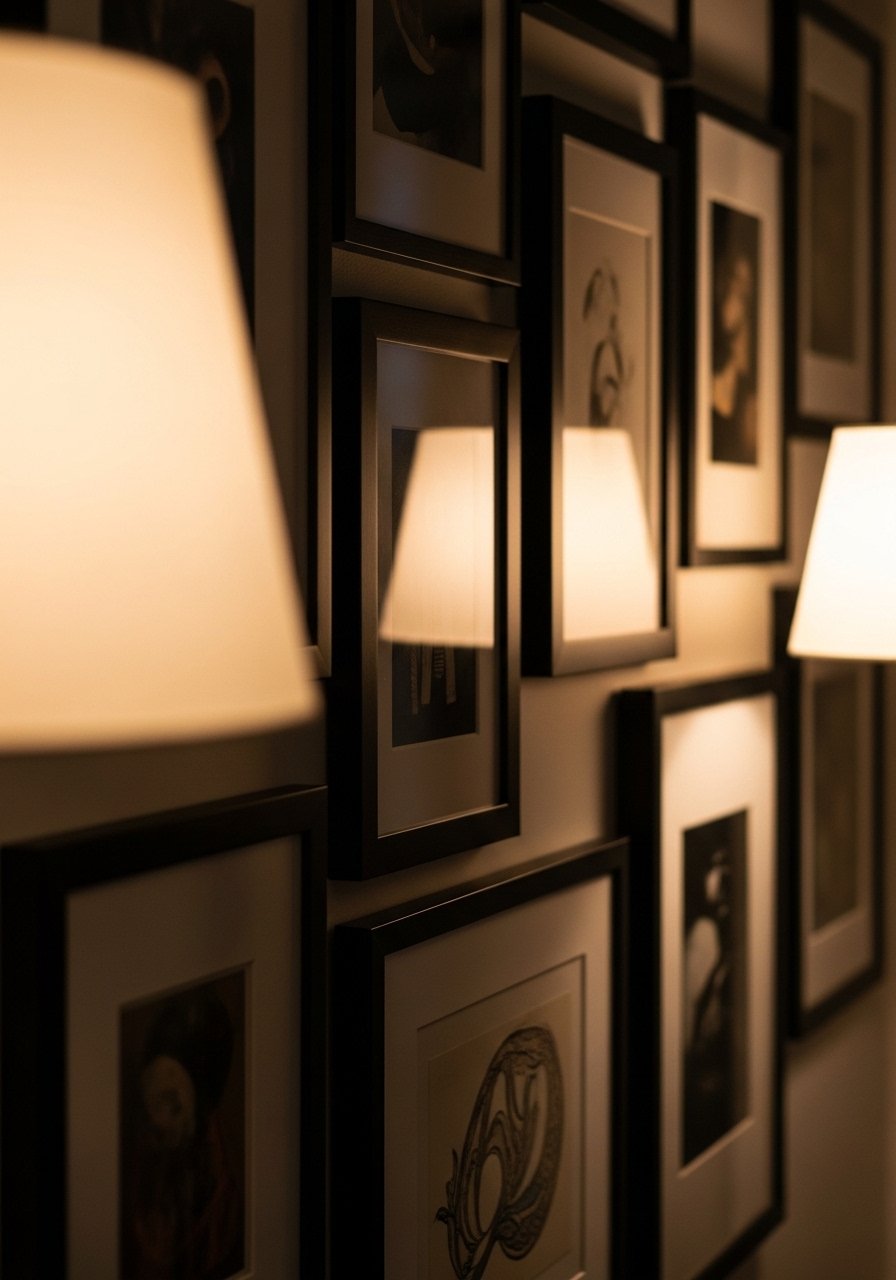
A salon wall feels collected when you balance printed photos and art. Aim for a 70/30 ratio of photos to original art so it stays personal without feeling like a gallery. Keep mats the same color to unify different sizes. This works for people who like an eclectic, lived-in vibe and for medium budget collectors. I use the rule of three odd groups across the wall to make it look natural. Pick lightweight frames like natural-11×14-frames-set-of-6.
Mistake to Avoid: Mixing mat colors breaks visual flow and makes different pieces fight for attention.
3. Single Large Anchor Piece With Mini Gallery Around It
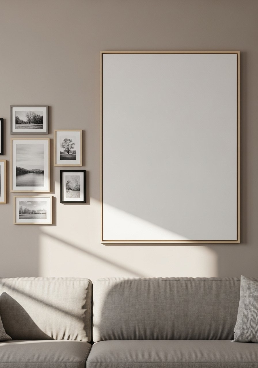
Center a large print at eye level, then arrange three to five small frames around it to complement. The big piece gives the camera a focal point, so the smaller works read like thoughtful accents. Great for small families who own a standout artwork but want more personality. Measure the anchor at about two-thirds the sofa length for balance. I like pairing a linen canvas with vintage-look frames such as gallery-stretched-canvas-30×40.
Mistake to Avoid: Choosing an anchor that is too small makes the cluster look like a decal instead of a statement.
4. Black Frames Only For High-Contrast Feeds
If your Instagram aesthetic is crisp and modern, using only black frames creates graphic cohesion. Keep spacing tight at 1.5 to 2 inches and mix vertical and horizontal pieces for movement. Works on pale walls and on darker paint if you choose thin black frames. This is a low-cost way to get a polished look because matching frames are usually cheaper in bulk. Try thin-black-frames-8×10-set-of-8.
Mistake to Avoid: Using different black finishes makes the wall look mismatched rather than cohesive.
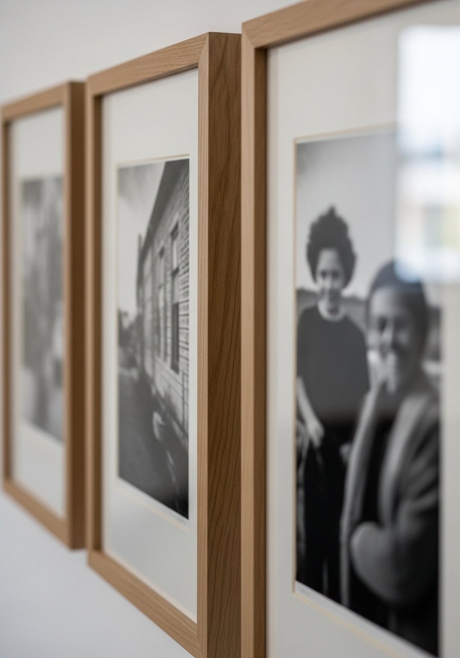
5. Warm Wood Frames For Cozy, Timeless Mood

Wood frames soften a gallery wall and photograph as warm and approachable. Stick to one wood tone and vary sizes to keep it dynamic. Works for rooms with warm textiles or rattan furniture, and for renters who prefer a softer look. Use a 60/40 balance of art to photography to keep it feeling curated. Lightweight oak-effect frames like walnut-photo-frames-set-of-5 look richer than their price suggests.
Mistake to Avoid: Mixing two very different wood tones creates visual friction that shows up on camera.
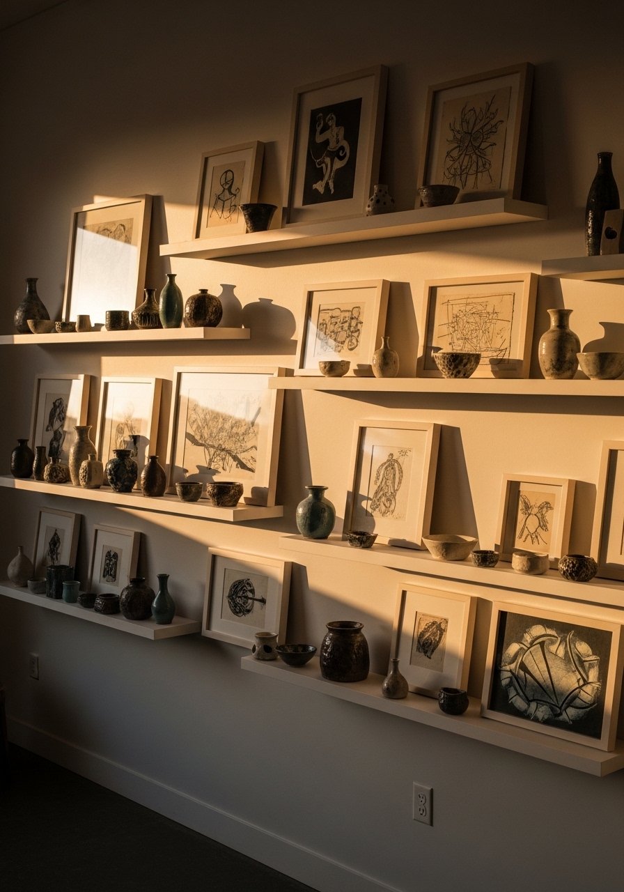
6. Linear Shelf Gallery For Easy Rotation
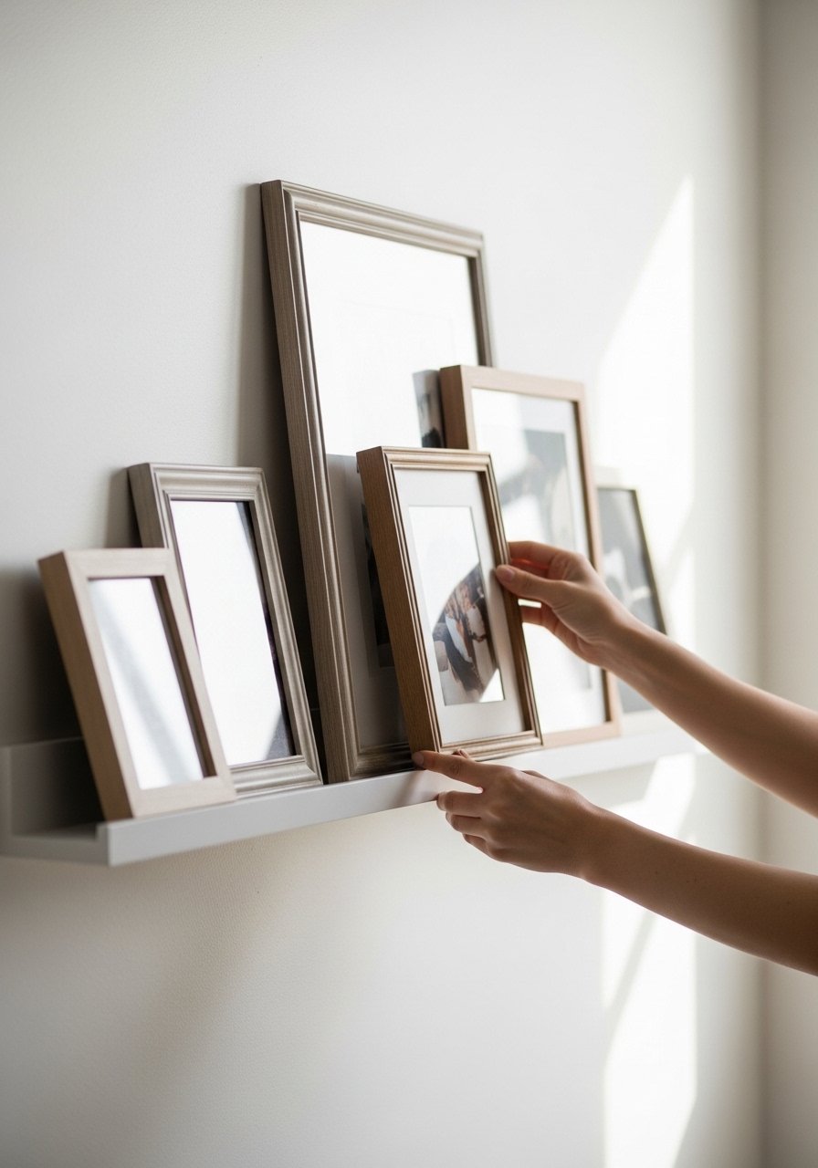
A shallow picture ledge is a renter-friendly cheat. Lay prints on the shelf and overlap by an inch or two for depth. Rotation is simple, which is ideal if you like swapping prints for seasons or mood. Shelf depth should be at least 3 inches for stability. Pair with a few small objects to stop it feeling like a museum. I use floating-picture-ledge-36-inch because it supports frames and small plants.
Mistake to Avoid: Overlapping too tightly hides important details in prints and reads cluttered in photos.
7. Staircase Run With A Graduated Frame Scale
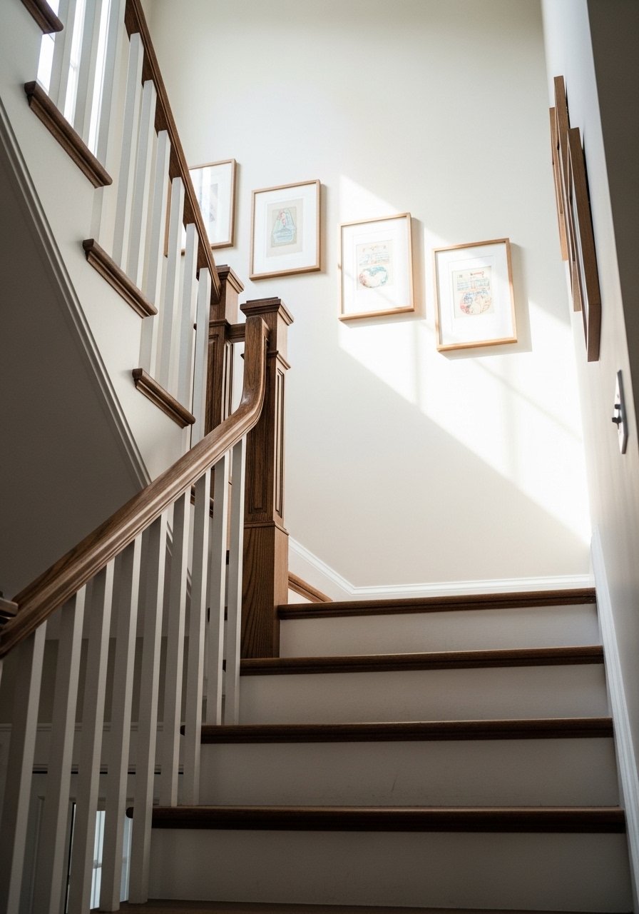
Follow the stair line and scale frames from small at the bottom to larger at the top or vice versa. Keep centers aligned on an invisible diagonal that matches stair pitch. This is great for long runs and for families who want to display many pieces. Use consistent mat width to tie the different sizes together. Use mixed-size-frame-set-5-to-7 that includes multiple orientations.
Mistake to Avoid: Randomly placed frames on stairs look accidental and off-balance in photos.
8. Minimal Two-Row Layout For Wide Walls
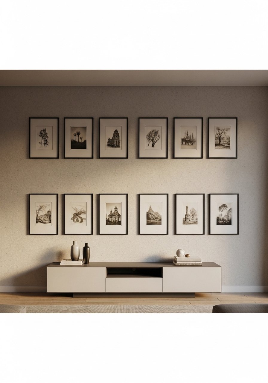
Two even rows are a modern alternative to a big grid. Keep the rows 2 to 3 inches apart and center the whole composition on furniture below it. This layout photographs well because it mirrors horizontal lines like consoles or sofas. Works for longer walls where a tall gallery would overwhelm. For a uniform look choose matching mats such as white-matted-frames-11×14-set-of-8.
Mistake to Avoid: Unequal mat sizes in the rows make the composition look lopsided in photos.
9. Mixed Media Wall With Textiles And Frames

Combine framed pieces with a small textile or macramé to break the flat plane. Keep the textile no more than one-third of the wall area so it reads as accent. This is a good gap competitors miss because textiles add real depth on camera. For renters, use removable hanging hardware for the textile. Try a lightweight woven piece like small-woven-wall-hanging-20×30.
Mistake to Avoid: Using a heavy textile that hangs lower than the frames makes the composition top-heavy.
10. Round Frame Cluster For Soft, Organic Feel
Round frames break up a room of straight lines and photograph as gentle and intentional. Mix sizes but keep at least three repeats of one size to create rhythm. This works in nurseries, entryways, and over a vanity. Keep spacing wider, about 2.5 inches, so circles have breathing room. round-picture-frames-set-of-7 gives a ready-made palette.
Mistake to Avoid: Crowding circles makes them lose their shape and look messy on camera.
11. Black-and-White Photo Wall For Timeless Contrast
A wall of monochrome photos reads consistent and editorial on feeds. Keep a uniform print style, either glossy or matte, to avoid glare and reflections. This suits homes with monochrome textiles and modern furniture. For better framing, print at consistent aspect ratios and use matte-8×10-photo-paper-pack for gallery-quality prints at home.
Mistake to Avoid: Mixing glossy and matte prints creates unwanted reflections in photos.
12. Color-Blocked Gallery With A Dominant Accent Hue
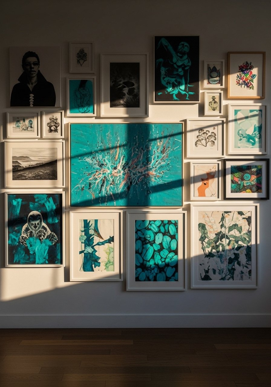
Pick one accent color and repeat it across different artworks and frames. It ties diverse pieces together and reads strongly on camera. Use about three to five elements carrying the color so it feels intentional not forced. This is a good way to pull a room palette from a rug or throw. Try swapping in a framed piece like teal-abstract-print-16×20 to anchor the scheme.
Mistake to Avoid: Overusing the accent color turns it into a spot that overpowers everything else.
13. Mirror Mix To Bounce Light And Add Depth
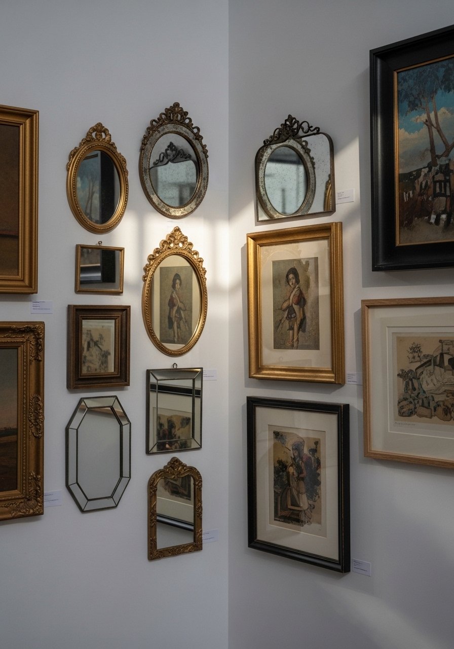
Mirrors double light and create depth especially in small rooms. Alternate mirrors with frames of similar scale and keep a 2-inch gap. This is perfect for narrow entries or behind seating that needs more light. Use lightweight, shatter-resistant mirrors if you live with kids or pets. I like small-round-mirror-12-inch for cluster accents.
Mistake to Avoid: Placing mirrors where they catch camera flashes makes photographing the wall harder.
14. Map Wall For Travel-Lover Storytelling
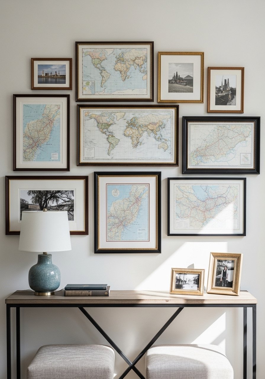
Layer maps with photos from the locations for a personal travel narrative. Use a larger map as an anchor and smaller frames for trip photos. Keep margins consistent, about 1.5 inches between frames. This layout tells a story for people who travel and like a curated feed. For affordable maps try regional-wall-map-print-24×36.
Mistake to Avoid: Randomly scattering maps and photos without a visible center makes the wall feel slapped together.
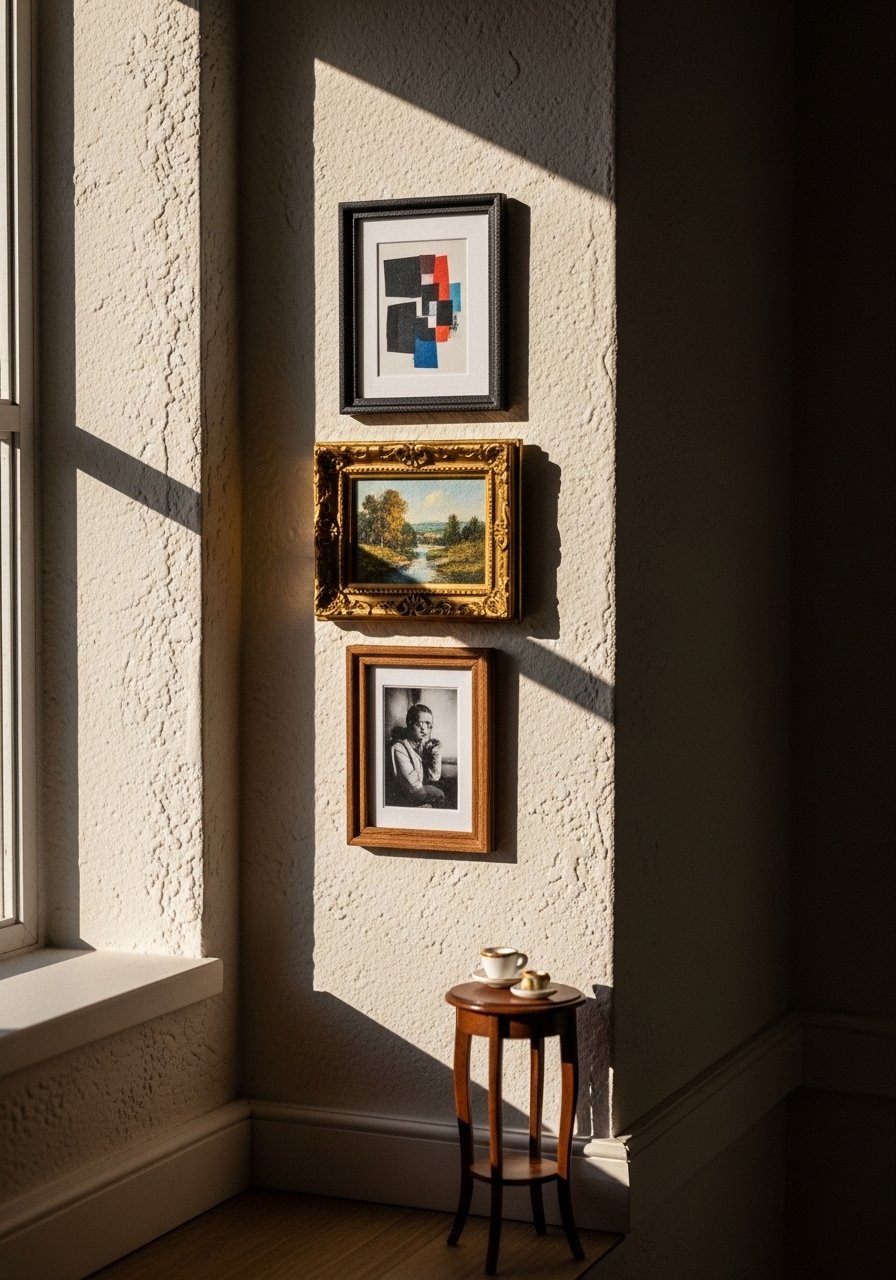
15. Gallery Corner For Tight Spaces
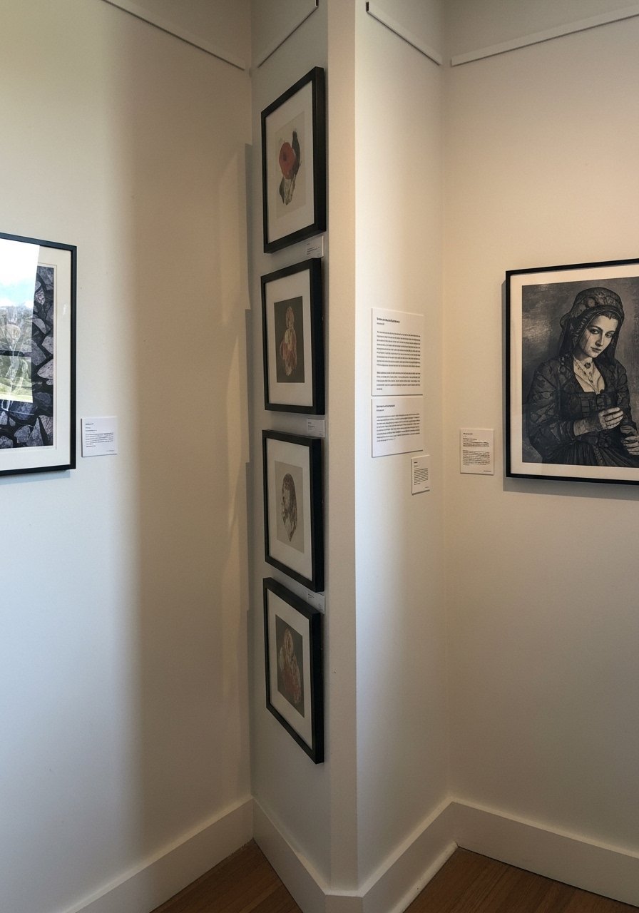
Corners can be hard to decorate. Create a vertical column of narrow frames that wraps the corner gently by keeping frames shallow and spacing tight at 1.25 inches. This works when you have little wall space but want maximum impact. Use thin frames to keep the column from feeling bulky. narrow-portrait-frames-set-of-4 are ideal for this.
Mistake to Avoid: Choosing wide frames in a corner makes them intrude into walkways and read clumsy in photos.
16. Poster-Led Gallery For Bold, Immediate Impact
Large poster prints give an instant social-media-friendly backdrop. Use a 24×36 poster as your centerpiece and arrange smaller 11×14 or 8×10 frames around it. This is budget-savvy because posters are cheaper than originals and still read bold. For easy framing try poster-frame-24×36-black.
Mistake to Avoid: Folding or rolling posters improperly causes creases that photograph poorly.
17. Layered Mats For Gallery Depth On A Budget
Add depth by using a double mat in the same tone instead of buying larger frames. A 2:1 mat-to-print ratio gives the eye room and photographs as higher quality. This is an affordable trick for prints that feel small on their own. Use consistent mat widths across the wall for cohesion. Pick premade mats like double-mat-kit-8×10-to-11×14.
Mistake to Avoid: Using mixed mat widths makes the wall look inconsistent and amateurish.
18. Negative Space Strategy For Breathing Room
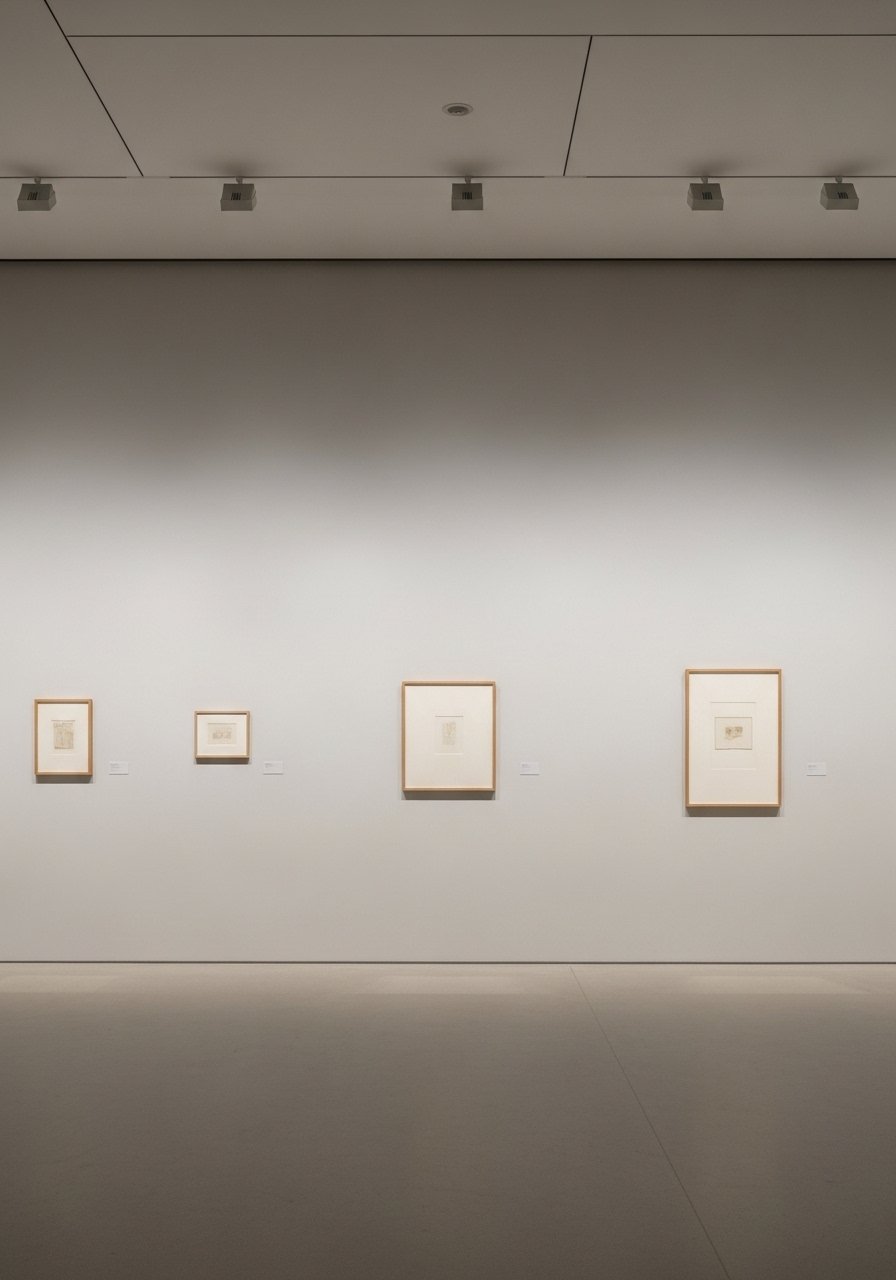
Sometimes less is more. Spread fewer, larger pieces with 4 to 6 inches between them to let each image breathe. This technique reads editorial on feeds and suits minimal or Scandinavian interiors. It is renter-friendly because it uses fewer holes and less hardware. Use large scale pieces like abstract-canvas-30×40-neutral.
Mistake to Avoid: Filling every inch of wall makes a room feel smaller and the photos look busy.
19. Layering With Shelves And Small Objects
Integrate shallow shelves with frames and one or two ceramics or plants. Objects add texture and stop the wall from feeling flat when photographed. Keep objects small and low so they do not compete with frames. This suits people who like to change displays seasonally. Try the slim picture-ledge-24-inch for versatile layering.
Mistake to Avoid: Using large objects on shallow ledges increases the risk of items toppling and photos looking cluttered.
20. Vintage Poster Collage With Uniform Frames
Group vintage posters in identical frames and use a repeating mat color to unify the aged paper. The result photographs as collected and curated. For authenticity pick posters with shared palette elements. Works well above a bar cart or in a study. vintage-poster-frame-16×20 frames are good for this.
Mistake to Avoid: Leaving posters unprotected exposes them to fading and makes photos look washed out.
21. Small-Scale Gallery For Tiny Apartments
When wall space is scarce, choose three frames and arrange them in a triangle to create focus without overpowering the room. Keep frames 1.5 inches apart and center the trio above a small piece of furniture. This helps renters and apartment dwellers get a photo-ready wall without drilling a dozen holes. Try compact frames like mini-frames-set-of-3-5×7.
Mistake to Avoid: Filling a tiny wall with too many small frames makes it look cluttered and indistinct in photos.
22. Gallery With Sculptural Elements For Tactile Interest

Mix small wall-mounted sculptures or shadow boxes with framed art to add three-dimensional interest. Keep the sculptures at eye level and balance their presence with two-dimensional pieces. This approach photographs as layered and thoughtful. Use museum putty for secure mounts if you rent. small-wall-sculpture-iron-8×8 works well for accents.
Mistake to Avoid: Hanging heavy sculptural pieces without proper anchors risks damage and looks unstable in photos.
23. Seasonal Swap Template For Easy Refreshes
Create a template with fixed frame placement on the wall, then swap in seasonal prints and small objects. Keep the spacing and anchor points consistent so swaps take twenty minutes. This is great for people who like to refresh for holidays or seasonal color shifts. Use consistent frames like standard-frame-11×14-black to make swaps seamless.
Mistake to Avoid: Changing frame positions each season doubles the work and creates uneven wall marks.
24. Kid-Friendly Gallery With Clear Acrylic Frames
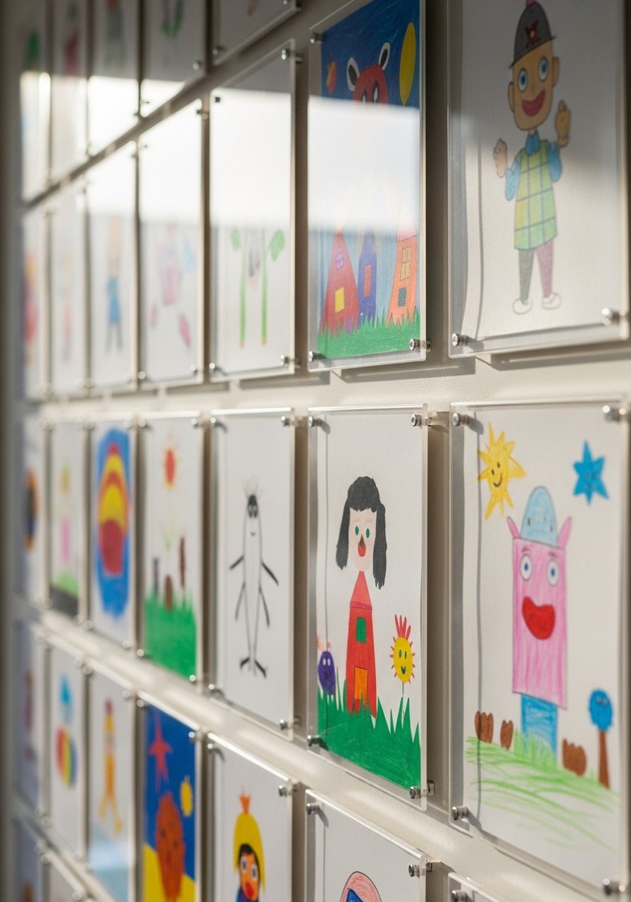
Display kids' art in clear acrylic frames so pieces look fresh and are easy to swap. Use a lower centerline so children can view and contribute. This approach makes family moments shareable without sacrificing style. Clear frames are forgiving and kid-proof. Try clear-acrylic-frames-set-of-6-8×10.
Mistake to Avoid: Using glass frames low on the wall risks breakage and photo glare.
25. Statement Frame With Mat Gallery For Polished Detail
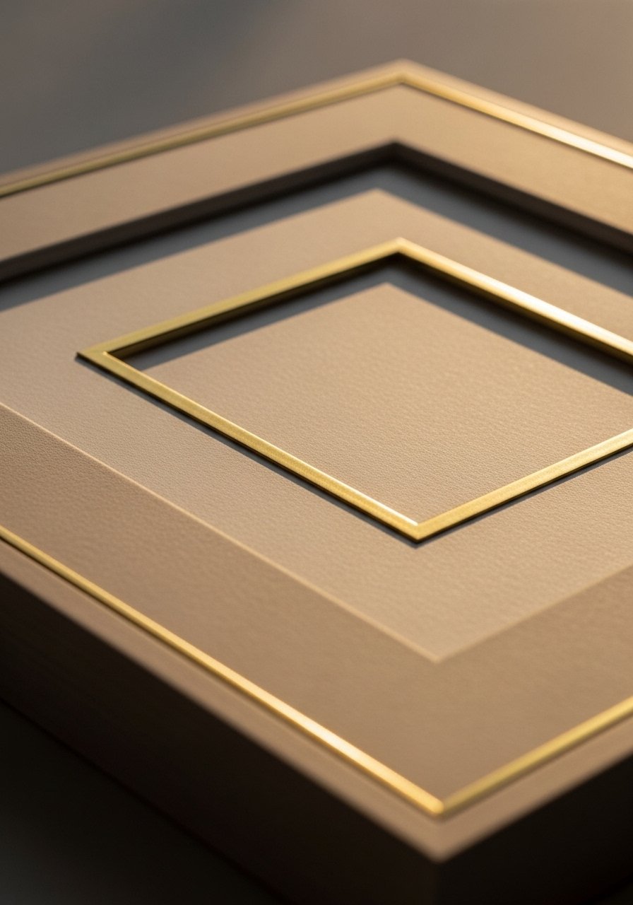
Pick one statement frame with a rich material like brass trim and use matching mats across smaller frames to make it feel elevated. The key is repetition, not excess. This reads polished in photos because the eye finds the repeated mat edge. Ideal for those with a mid-range budget who want one splurge piece. Consider brass-trim-frame-16×20 paired with plain mats.
Mistake to Avoid: Mixing a statement frame with many different mat styles dilutes the impact and looks uneven.
Your Decor Shopping List
Wall Anchors and Hardware
- Removable-picture-hangers-pack-of-10 (~$12), honest way to avoid multiple drywall holes. Good for renters.
- screw-and-anchor-kit-for-frames (~$9), sturdy anchors for heavier pieces.
Frames and Mats
- black-8×10-frames-set-of-12 ($), consistent basics for grids.
- natural-11×14-frames-set-of-6 ($$), warm wood look.
- white-matted-frames-11×14-set-of-8 ($$), for a clean, curated feed.
Shelving and Ledges
- floating-picture-ledge-36-inch ($$), easy rotation and layering.
- picture-ledge-24-inch ($), slim option for small spaces.
Prints and Paper
- poster-frame-24×36-black ($$), makes a bold centerpiece.
- matte-8×10-photo-paper-pack ($), consistent print finish.
Accent Pieces
- small-woven-wall-hanging-20×30 ($), adds texture without weight.
- small-round-mirror-12-inch ($), for bouncing light.
- clear-acrylic-frames-set-of-6-8×10 ($), kid-friendly swap outs.
- brass-trim-frame-16×20 ($$$), a single splurge that photographs well.
Decorating Tips Worth Knowing
Measure twice, mark once. Use a paper template to tape where frames will go, then photograph it from the sofa or the spot you’ll post from. painter's-masking-tape-1-inch prevents wall damage and saves time.
Pick a consistent centerline. Hanging the main center at 57 inches gives the camera-friendly eye-level that looks balanced in most rooms. tape-measure-16-foot is standard and cheap.
Use two different frame sizes, not seven. Limiting sizes to two or three makes a gallery read intentional. mixed-size-frame-set-5-to-7 simplifies shopping.
Mat finish matters. Matte prints reduce glare for cleaner photos. matte-photo-paper-pack-8×10 gives consistent results.
Anchor a wall to furniture. If you have a console or sofa, center the gallery on that piece and keep the top of the furniture and bottom frames about 6 to 12 inches apart. level-tool-with-magnetic-strip keeps everything straight.
Rotate seasonally with a template. Keep frame placement fixed and swap art for holidays or color shifts. picture-frames-set-with-stands makes swaps easy and keeps photos fresh.