
I kept shoving the sofa all the way back against the wall and wondering why the room still felt flat. One Saturday I dragged it forward three inches, added a low rug that reached under the sofa legs, and suddenly the whole living area read as intentional instead of shoved-together. It was a tiny move that fixed the scale problem I had been ignoring for years.
These ideas are for renters and homeowners who want a fresh modern look without a full renovation. Expect mostly renter-friendly swaps, a few small upgrades that require basic tools, and options that work on a modest budget or for someone willing to buy one investment piece. If you like clean lines, mixed textures, and layouts that feel lived-in but tidy, these are for you.
1. Pull The Sofa Off The Wall
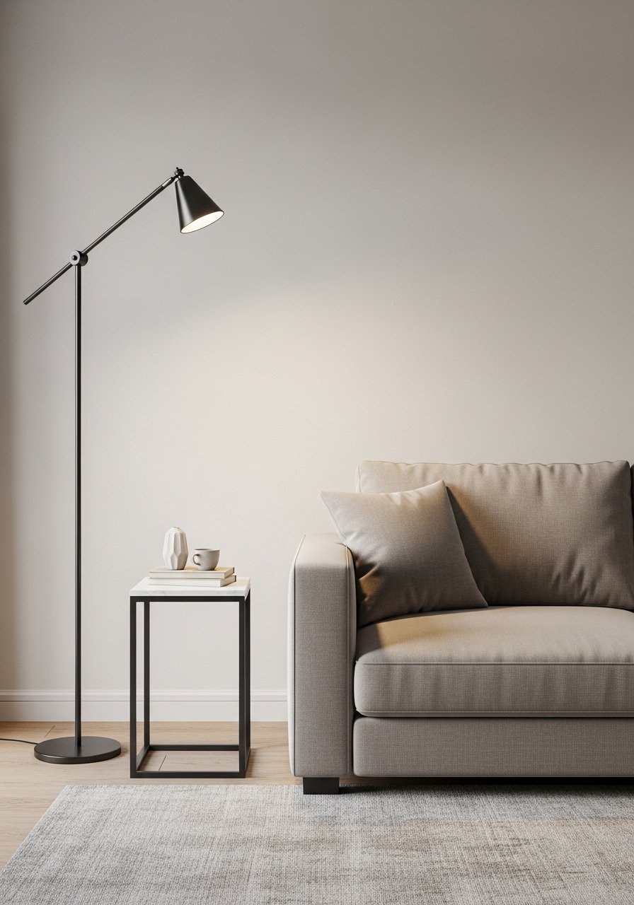
Moving a sofa forward adds intentional negative space behind it and invites a rug to anchor the seating zone. I aim for three to six inches behind the sofa so the entry flow stays clear, and to have the front legs sit on the rug, which visually ties the pieces together. This works for small apartments or large rooms because it creates pockets, and it is an easy renter-friendly change. Try a modular sectional sofa if you need flexible shapes.
Mistake to Avoid: Pushing the sofa completely to the wall and skipping an anchoring rug, which makes the room read chopped.
2. Layer Rugs, Start With One Large Anchor

A large anchor rug that extends under the front legs of all seating pieces sets the scale, then a smaller patterned rug on top adds texture and personality. My rule is the top rug should leave 6 to 12 inches of the anchor showing, which keeps the layers balanced instead of cluttered. This combo feels modern and cozy, and you can swap the top rug seasonally. For budget finds, I use a durable jute rug as the base.
Mistake to Avoid: Buying a rug that is too small so it floats under only the coffee table.
3. Replace One Wall Artwork With A Ceiling Fixture
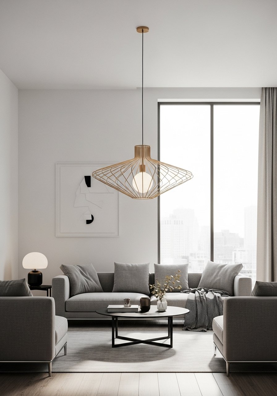
Instead of crowding one wall with art, install a sculptural ceiling fixture to draw the eye upward and create a focal point. A pendant 4 to 8 inches wider than the coffee table will read proportional. This feels unexpected in modern rooms and costs less than a full gallery wall. For renters, a heavy plug-in fixture can mimic the look without new wiring. I swapped in a sculptural pendant and it instantly grounded the layout.
Mistake to Avoid: Choosing a fixture that is too small for the seating area so it disappears.
4. Build A Low Gallery Shelf, Not A Full Wall

A slim picture ledge gives you the gallery feel without hammering 12 nails in the wall. Keep the ledge at eye level when seated, and work in a 2:1 ratio of frames to objects for balance. I like mixing a larger statement print with two smaller frames and one ceramic piece. It is renter-friendly and easy to refresh. Use a sturdy picture ledge shelf and swap the arrangement seasonally.
Mistake to Avoid: Centering the shelf too high, which makes the artwork float above the seating instead of relating to it.
5. Hang Curtains Higher And Wider
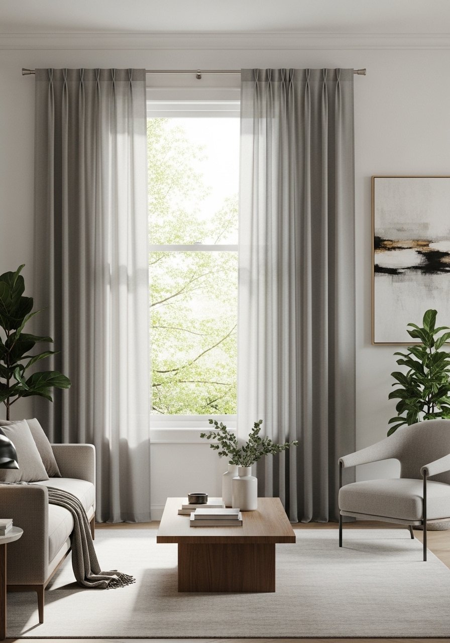
Raising the curtain rod four to six inches above the frame and extending it six to twelve inches past each side makes windows read taller and walls feel larger. Use light-filtering panels for a bright modern vibe, and heavier panels for a cozier finish. I prefer two long panels per window so they stack neatly when open. For an affordable update try linen blend curtain panels.
Mistake to Avoid: Hanging curtains just inside the window trim, which shortens the wall and makes the ceiling feel lower.
6. Build A Plant Corner With Scaled Pots
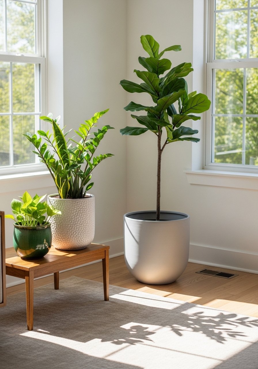
Grouping plants in three sizes builds a little indoor landscape and softens modern lines. Use a tall structural planter for a tree, a medium ceramic planter for a bushy fern, and a small glazed pot for a trailing plant. Pick planters that vary in finish rather than color so the group reads cohesive. A tall ceramic planter pairs well with a small watering can and a pot tray.
Mistake to Avoid: Using three identical pots, which flattens the composition.
7. Trade One Accent Chair For A Slim Bench
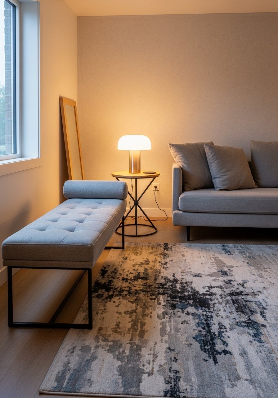
A bench reads lighter than a bulky accent chair, which makes traffic flow easier and keeps sightlines open. Choose a bench that is about one third the length of your sofa so it anchors without overpowering. Benches are great in narrow rooms and double as extra seating when friends arrive. For a versatile pick try a slim upholstered bench.
Mistake to Avoid: Picking a bench that is too deep, which can block circulation in smaller rooms.
If you want to shop while you scroll, here are the pieces I reach for most when I actually change a room.
Essentials For A Fresh Living Room
Textiles & Soft Goods:
- Velvet pillow covers (~$12 each). Swap these seasonally for instant texture.
- Linen curtain panels (~$30-50 per panel). Hang them high and wide.
- Jute area rug (~$80-150). A sturdy base layer for rug stacking.
Lighting & Small Fixtures:
- Plug-in wall sconce (~$40-80). Adds symmetry without rewiring.
- Sculptural pendant light (~$120-250). One focal fixture beats many small ones.
Decor & Furnishings:
- Picture ledge shelf (~$25-60). For rotating art and small objects.
- Tall ceramic planter (~$35-70). Use varying finishes for depth.
- Slim upholstered bench (~$100-200). Lightweight seating that reads modern.
8. Hide Clutter With A Two-Function Coffee Table

A coffee table that hides remotes, magazines, and blankets keeps the room feeling calm. Look for a lift-top or drawers that can handle a 12 to 18 inch stack of items. Function here is modern design. If you want the look but not the bulk, use a small storage ottoman as a coffee table. I paired a storage coffee table with a tray and it cleared visual clutter.
Mistake to Avoid: Choosing a coffee table that is too low or too small for the sofa, breaking the conversation circle.
9. Use A Three-Pillow Rule With Varying Scale
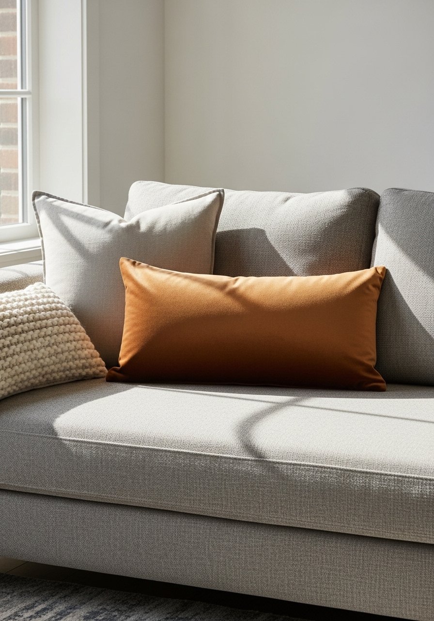
Layer pillows in a 1-2-1 proportion: one oversized cushion at each end, two medium squares across, and one small toss if needed. The sizes should vary by at least four inches so each creates a tier. Swap covers seasonally for a fresh palette. I keep an inexpensive set of pillow covers on hand to change the room mood without extra storage.
Mistake to Avoid: Buying five same-size pillows, which reads chaotic and flat.
10. Add Plug-In Wall Sconces For Balanced Light
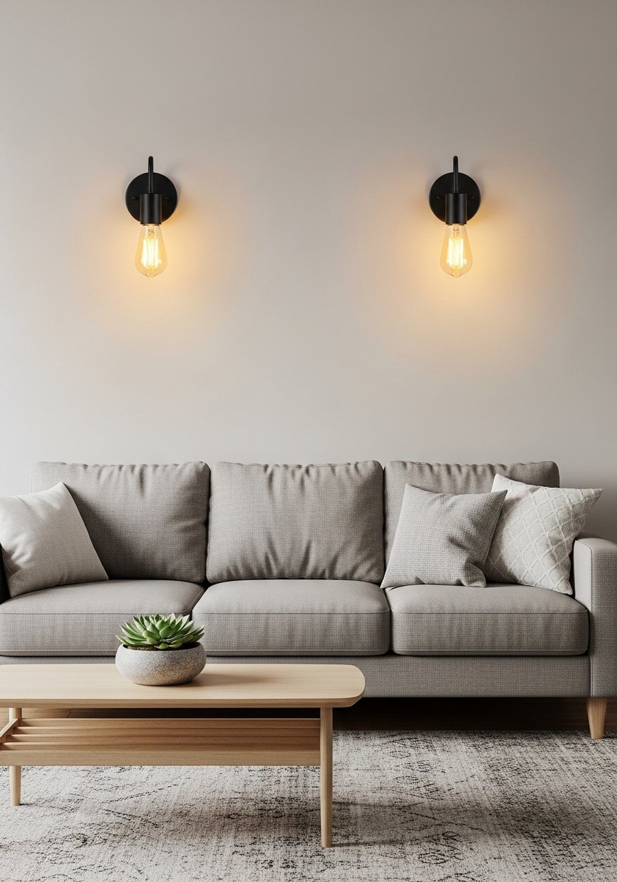
Symmetry makes modern rooms feel deliberate. If hardwiring is off the table, plug-in wall sconces mounted at eye level when seated create even lighting and free up floor space for art or plants. Aim for sconces that place the bulb four to six feet above the floor. I installed a pair of plug-in sconces and it balanced my living area without electricians.
Mistake to Avoid: Relying on a single overhead light that creates harsh shadows.
11. Lean A Wide Mirror To Open The View
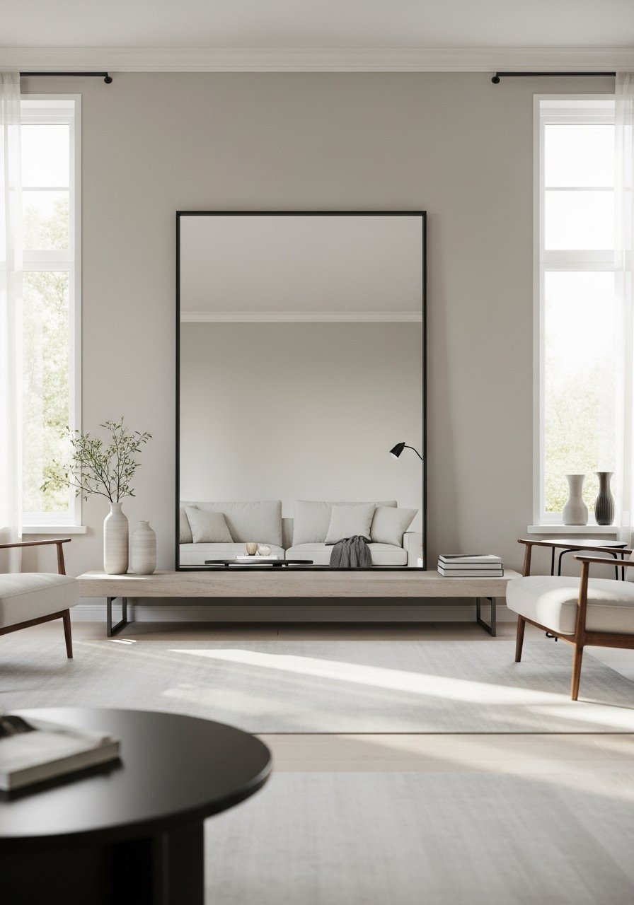
A wide mirror leaned on the floor behind a sofa reflects daylight and doubles the perceived depth of the room. For safety, secure the top with an anchor or anti-tip kit, and angle it slightly to avoid direct glare. Mirrors work in rental homes, and a floor mirror about half the sofa length reads proportional. Source a simple wide floor mirror for an affordable sense of space.
Mistake to Avoid: Hanging small mirrors that break up reflection instead of amplifying it.
12. Use Scaled Collections Of Ceramics And Glass
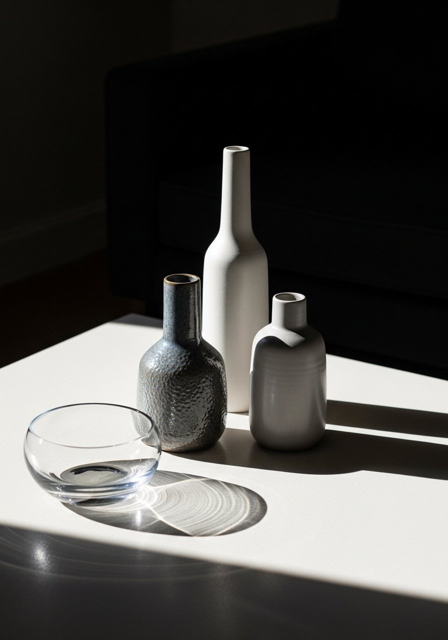
Group decorative objects in odd numbers and varied heights to feel curated instead of cluttered. I like a 3:1 height ratio, for example two low forms and one taller vase. Stick to two finishes across the group for cohesion. This is an easy way to refresh without painting or new furniture, and a set of ceramic vases can change the mood seasonally.
Mistake to Avoid: Mixing too many finishes and sizes so the display looks mismatched.
13. Make A Reading Nook With A Task Lamp And Side Table

A compact reading nook needs three things: comfortable seating, targeted light, and a small surface. An adjustable task lamp that casts direct light on your lap is better than an overhead source. Keep the chair about 18 inches from the side table for reachability. I used an adjustable task lamp and it made late reading without bothering others possible.
Mistake to Avoid: Choosing only ambient light, which forces you to hold the book at awkward angles.
14. Frame Textiles Or Mirrors As Art
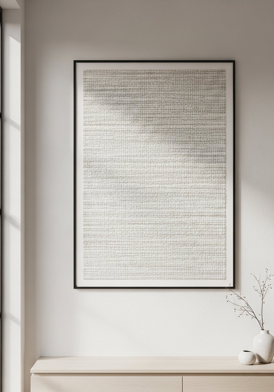
Nontraditional art like a framed textile or a collection of small mirrors carries texture and modern warmth. Use a simple frame to keep the focus on the material, and balance it with a smaller print opposite to avoid heaviness. This is renter-friendly when you use picture ledges or Command picture hanging strips. I framed a favorite textile and it suddenly read like an intentional piece. Consider a simple floating frame.
Mistake to Avoid: Overframing small textiles in heavy ornate frames that compete with the piece.
15. Choose Warm Metals And Soft Matte Finishes

Warm metals like aged brass or soft gold add glow without being flashy, especially when balanced with matte ceramics or unfinished wood. Use them in small doses, two to three accents in the same finish, so the room reads cohesive. A brass tray on the coffee table and matte lamp bases create a layered finish that still feels modern. Try a brass serving tray.
Mistake to Avoid: Mixing three or more metal finishes in the same vignette, which can feel disorganized.
Small Habits That Keep It Feeling New
Thin swaps keep momentum. Swap velvet pillow covers seasonally, and the whole room changes without a full redecoration.
Grab removable command picture strips. They let you rearrange artwork and avoid new holes when you try a different layout.
I always sweep under the sofa weekly with a slim stick vacuum, not later. A slim cordless vacuum keeps dust from piling up and keeps textiles looking fresh longer.
Most people leave all their pillows squared. Instead, rotate them, plump them, and flip the covers once a month. A set of plumping pillow inserts keeps cushions full and the sofa looking edited.
If you move furniture, measure the rug and coffee table spacing first. Aim for 18 to 24 inches between sofa and coffee table for comfortable reaching, and the room will feel both practical and considered.